Dotted Line Reporting in an Org Chart: Meaning, Examples, Pros & Cons
Dotted-line reporting reflects shared responsibilities without direct authority. This guide explains when to use them, how to show them, and the pros and cons, plus how to visualize dotted lines automatically with OneDirectory.

If you’re a manager you've probably experienced the struggle with managing dotted line reporting relationships within your team.
Dotted line reporting means an employee has a secondary manager (often for a project, function, or matrix team) in addition to their direct manager. In an org chart, a solid line shows primary authority; a dotted/dashed line shows secondary oversight or shared responsibility.
Blurred lines of authority, confusion around responsibilities, miscommunication; dotted line relationships in your org chart can create challenges. But they do have their benefits.
In this article we'll explore whether you should consider using dotted line relationships in your organizational chart or organigram, and if so, how you can make them work for you.
Let's dive in.
Comparison: Dotted Line vs Solid Line Reporting
| Aspect | Solid Line Reporting | Dotted Line Reporting |
|---|---|---|
| Authority level | Primary authority over role, priorities, and decisions | Secondary or shared authority, usually limited to a project or function |
| Performance reviews | Owns formal reviews, ratings, and compensation input | Provides feedback, but typically doesn’t own formal reviews |
| Goal setting | Sets core role goals and long-term objectives | Influences project-based or functional goals |
| Day-to-day task direction | Provides main direction and workload prioritization | Gives guidance for specific initiatives or tasks |
| Conflict resolution path | Final decision-maker in priority conflicts | Escalates conflicts to the solid line manager when needed |
What is Solid Line Reporting?
In a typical organizational structure, every employee reports to a direct manager (aka their "boss"). This is represented on an organizational chart as a solid line connecting these two people, and it's what we call a solid line reporting structure.
Solid line reporting indicates that there is a direct reporting relationship between two individuals, and it means that one person has authority over another and can give out orders and instructions.
What is Dotted Line Reporting?
A dotted line, on the other hand, is an informal relationship between two people or teams in an organization.
If an employee has a dotted line manager it means that, in addition to reporting to their direct manager, they also report indirectly to a secondary manager or supervisor (who may be in another team).
This which is what we call a dotted line reporting relationship, and the term "dotted line" refers to the lines on an organizational chart.
What Does a Dotted Line Mean on an Org Chart?
A dotted line on an organizational chart diagram indicates that an indirect or secondary relationship of authority or responsibility exists between the two positions or people that the lines are connected to.
Dotted lines can also be used to indicate relationships that are temporary or subject to change, such as when an employee is filling in for another position.
In general, the more dotted lines there are between two positions, the weaker the relationship is between them.
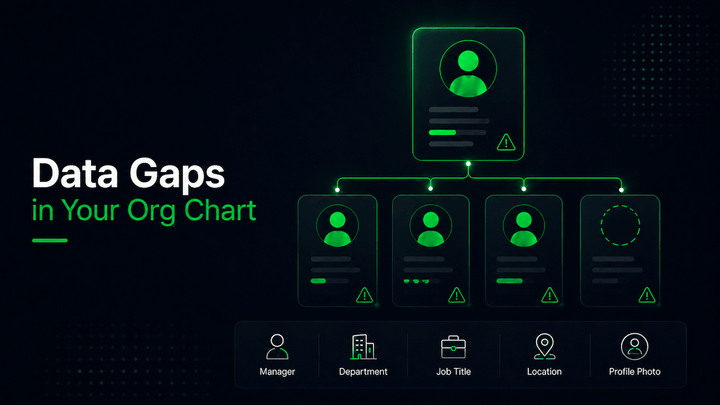
Why Include Dotted Line Reporting in Your Org Chart?
Dotted line reporting is an important concept because it recognizes special relationships between employees and managers that don’t necessarily fit into the traditional hierarchy of an organization.
Including these relationships in your org chart helps ensure that everyone understands who to go to if they have questions or need assistance at work.
Dotted line relationships also allow you to quickly identify which employees have special skills or roles, making it easier for managers and executives to make decisions on who should be involved in certain projects or initiatives.
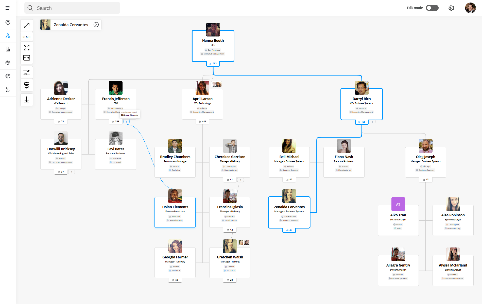
Create an interactive org charts with dotted-line reporting in seconds.
OneDirectory lets you visualize complex reporting relationships, solid or dotted, automatically from your Microsoft 365 data. No manual drawing, no maintenance.
The Benefits of Using Dotted Lines in Your Org Chart
Adding dotted lines to your organizational chart is a great way to strengthen relationships between colleagues and to streamline communication at work.
Where a solid line reporting relationship indicates the "hierarchy of managers" in your company, a dotted line reporting structure helps to further clarify roles and responsibilities, which can lead to increased productivity.
Let's take a look at the benefits of dotted line reporting:
- Enhanced Communication: Employees can seek assistance and support from multiple managers, ensuring quicker responses and reduced bottlenecks.
- Clarified Roles and Responsibilities: Clearly define responsibilities across teams, reducing confusion and improving efficiency.
- Improved Collaboration: Promote cross-departmental teamwork, helping employees better understand broader organizational operations.
 Lawrence Cawood
The Disadvantages of Using Dotted Lines in Your Org Chart
Using dotted lines in your organizational chart can help represent complex relationships, but they also introduce challenges if not clearly defined.
While dotted line reporting can improve flexibility, it may reduce clarity around authority, accountability, and communication.
Let’s take a look at the disadvantages of dotted line reporting:
- Can Lead to Miscommunication: Employees may interpret dotted line relationships differently, some see them as shared authority, others as informal collaboration, and some as having no real authority. This inconsistency can lead to mixed expectations and miscommunication across teams.
- Blurs the Boundaries of Authority: Dotted lines can make it unclear who the primary decision-maker is for tasks, priorities, or performance feedback. This often results in delayed decisions, duplicated effort, and stalled projects.
- Makes Org Charts Harder to Read and Maintain: As more dotted line relationships are added, org charts become more complex and harder to interpret. Showing too many solid and dotted lines in a single view can overwhelm employees and reduce the chart’s overall effectiveness.
Real-World Examples of Dotted Line Reporting
Dotted line reporting is most effective when it’s used intentionally and clearly. Below are three common real-world scenarios where dotted line relationships make sense, and where they often cause confusion if not documented properly.
Regional vs Functional Reporting Lines
In global organizations, dotted line reporting is often used to balance regional needs with functional consistency.
For example, a Marketing Manager in France may report solid line to the Country Manager, who owns local priorities, budgets, and performance. At the same time, they may report dotted line to the Global Head of Marketing, who sets brand standards, strategy, and shared campaigns.
This structure helps global organizations scale, but only when reporting lines are visible and expectations are clearly documented.
When Dotted Lines Become a Problem
Dotted line reporting becomes counterproductive when org charts are overloaded with secondary relationships. Too many dotted lines make ownership unclear, slow down decision-making, and create frustration for employees who don’t know whose direction takes priority.
A common best practice is to:
- Limit dotted line relationships to clear, meaningful responsibilities
- Avoid stacking multiple dotted lines onto a single role
- Create separate org chart views for different contexts (for example, a functional view and a project view)
When organizations use multiple views instead of a single overcrowded chart, employees gain clarity without sacrificing flexibility.
Frequently Asked Questions: Org Charts
What should an org chart include?
A good org chart includes:
- Job titles and employee names (or just roles if preferred)
- Clear reporting lines (who reports to whom)
- Departmental groupings
- Leadership hierarchy
- Optional: contact info, photos, locations, dotted-line relationships
Who creates the org chart in a company?
Org charts are typically created by:
- HR teams – for onboarding, workforce planning, and internal clarity
- Operations or administrative staff – to maintain structure across teams
- People managers – when mapping out team-specific structures
In modern organizations, automated org chart software (like OneDirectory) often handles creation and updates via real-time data syncing.
What is the best tool for org charts in Microsoft 365?
For Microsoft 365 users, OneDirectory is the top choice. It:
- Integrates directly with your Microsoft 365 data
- Automatically updates with role or team changes
- Provides searchable, interactive org charts
Conclusion
The ins and outs of dotted line reporting can be tricky to navigate, but if done well it can improve communication and collaboration throughout your organization.
By understanding how to "read" the dotted line relationships in your org chart and how to manage the boundaries of authority they can affect, everyone in your organization can benefit from the improved clarity they bring to your organizational structure.