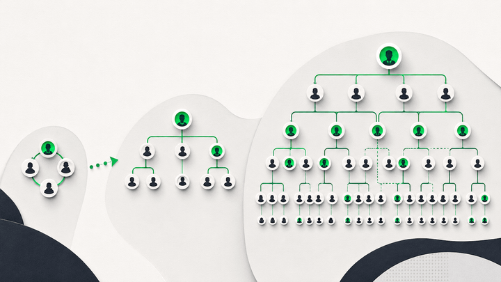
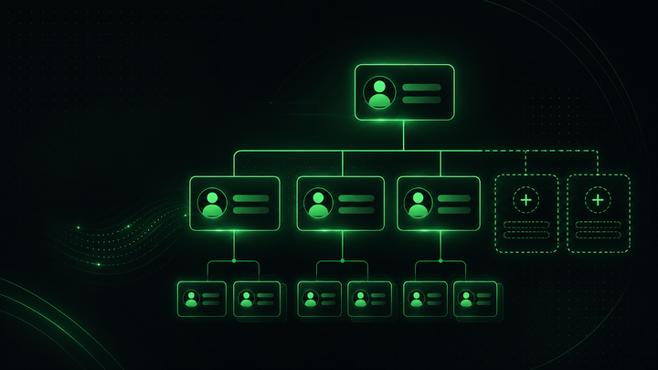
What is an Organigram? (Organogram)
An organigram is a picture of one field in your employee directory. Across 65 Microsoft 365 tenants at first sync, that field was filled in for 42% of employees.

An organigram is a picture of one field in your employee directory.
Across 65 Microsoft 365 tenants measured at first sync, before any cleanup work, that field was filled in for 42% of employees. Most organigrams are not wrong because somebody drew them badly. They are wrong because the data underneath them is half empty.
This page covers what an organigram is, the four words people use for it, the three types you will meet, and why they go stale.
What is an organigram?
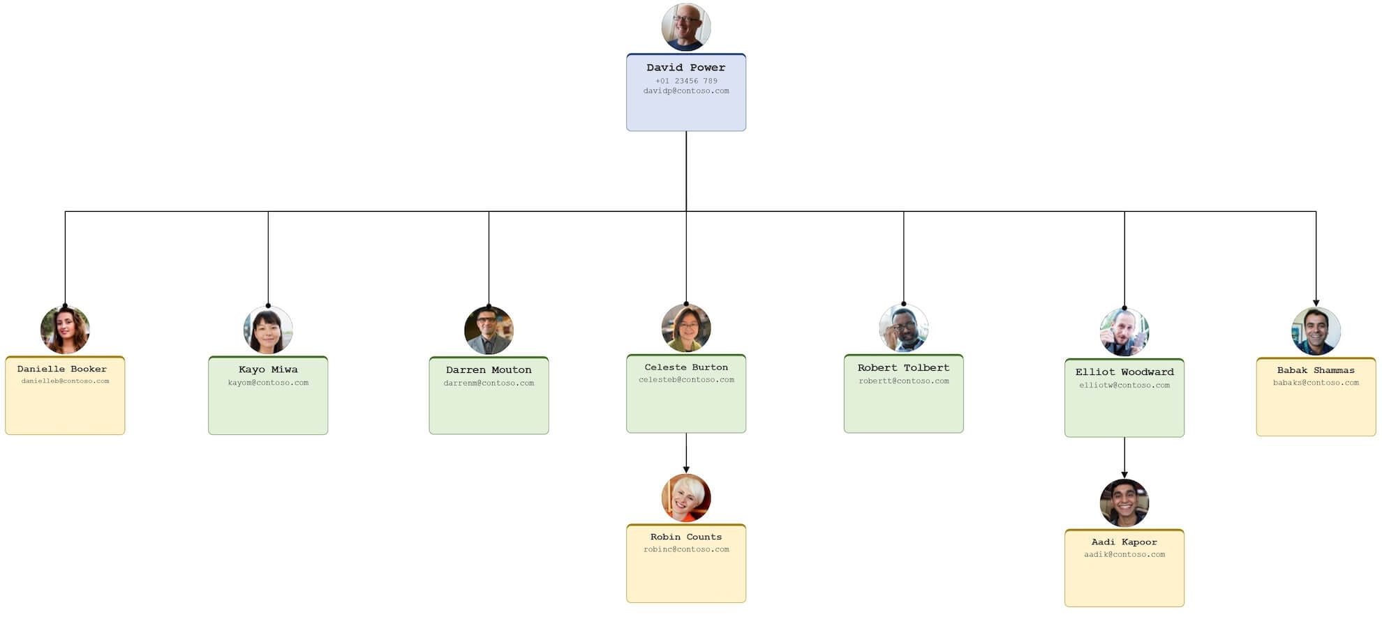
An organigram shows the structure of an organization. Who reports to whom, how people group into teams and departments, and where authority sits. It is read top down, leadership first, reporting lines cascading below.
Three pieces of employee data build it: name, job title, manager. The third does the structural work. Name and title fill the boxes. The manager relationship draws the lines between them.
In a Microsoft 365 organization that relationship lives in Microsoft Entra ID. It is read through the Microsoft Graph manager relationship. Org chart software does not invent it. It reads it.
Organigram, organogram, org chart: the words are interchangeable
People reach this page having typed four different words for one diagram. Worth settling.
| Term | Where you mostly see it | Means anything different? |
|---|---|---|
| Organigram | Europe, from the French organigramme. Common in UK and Irish business writing. | No. |
| Organogram | UK, India, South Africa, and most public-sector documents. | No. Same diagram, different spelling. |
| Org chart | United States, and most software product pages. | No. This is the most searched of the three. |
| Organizational chart | Formal writing, HR policy, academic work. | No. The long form of org chart. |
| Hierarchy chart | Occasionally, usually for a single reporting line. | Slightly. It implies levels only, not teams or departments. |
So if a colleague asks for the organogram and your software says org chart, nobody is talking about different things.
The three organigram types you will actually meet
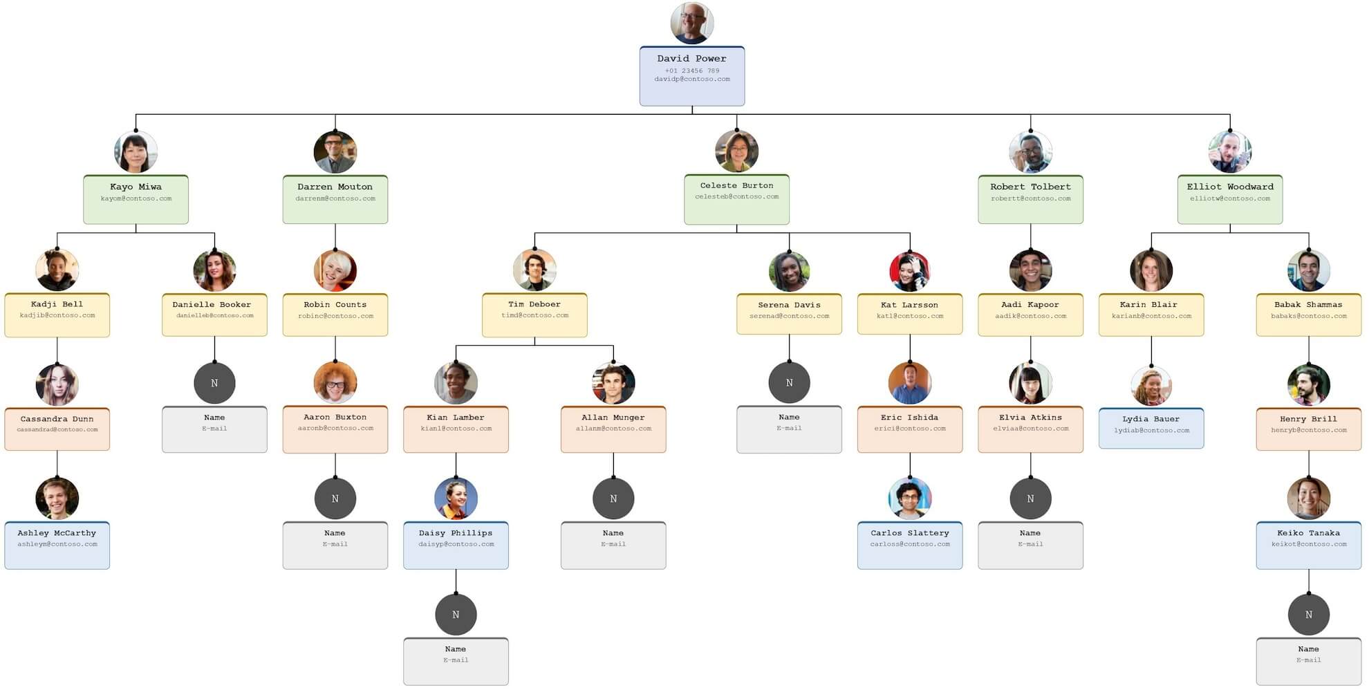
Hierarchical
The most common shape, and roughly a triangle. One person at the top. Authority passes down through layers of management to individual contributors, and every employee has exactly one manager.
It breaks down when real authority does not follow the drawn line. That is common in organizations grown by acquisition.
Matrix
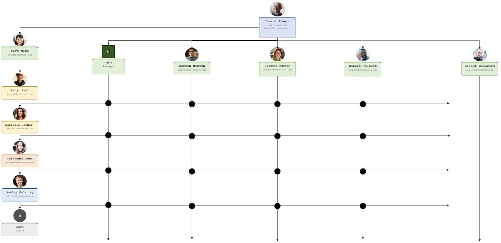
More of a grid than a triangle. An employee has a functional manager and a project manager. That means two reporting lines rather than one, and the second is usually drawn as a dotted line.
This is where most org chart software struggles. A single manager field cannot express two managers. Read the matrix organizational structure guide if this is the shape you are mapping.
Flat
Very few layers of management, and most employees operating independently. Common in small companies, and in organizations that treat low hierarchy as a value. See the flat organizational structure guide for where that holds and where it stops holding.
Flat structures gain layers as headcount grows. The organigram is normally the last thing to notice.
What organigrams get used for
Six uses come up repeatedly. Only the first two are the ones people expect.
- Onboarding. A new hire seeing where their role sits, and who to ask about what, in their first week.
- Finding the right person. Working out whose approval a project actually needs, rather than asking in a group chat and hoping.
- Workforce planning. Modeling a team that does not exist yet, and seeing the cost of the shape you are proposing.
- Succession planning. Mapping what happens to a reporting line when a manager is promoted or leaves.
- Team structure. Clarifying who leads what, particularly across cross-functional teams.
- Employee directory. Used alongside an employee directory, the organigram becomes the navigation layer rather than a poster.
Where organigrams fail, with numbers attached
The honest limitations are worth stating, because two of the three cannot be fixed by better software.
They go stale, and the gap is measurable
We measured 65 Microsoft 365 tenants at their first sync with OneDirectory, before any cleanup work, for The State of Employee Directories in 2026. At that first read of untouched directory data:
- The manager field was populated for 42% of employees.
- Average profile completeness across the core directory fields was 30.8%.
- 33% of organizations were directory-ready, meaning name, email, job title and photo each at 60% coverage or above.
An employee with no manager cannot be placed under one. That is the whole mechanism behind an organigram with people missing. It is a data problem, not a drawing problem.
Almost nobody looks at the whole thing
This one argues against us, so here it is plainly. Across 16,267 employees in 65 organizations, over the 90 days to 14 August 2026, employees opened an org chart 39,854 times. They opened the whole-organization view 683 times. That is 1.7% of all org chart usage.
The useful organigram is not the wall poster of the whole company. It is the small local view around one person, opened to answer one question.
They show the formal structure and nothing else
An organigram records reporting lines. It does not record who gets consulted, who holds informal influence, or how a manager leads. Those relationships are real. They sit entirely outside the diagram.
So an organigram maps authority, not how work happens. Treating the two as one thing is the commonest mistake made with it.
What these numbers do not prove
The 65 organizations are a self-selected group. Every one had already decided its employee data needed work before we measured anything. Organizations that never gave it a thought are not in the sample. Their figures could be better or worse.
The 42% is a baseline, not a verdict on Microsoft or on any vendor. Any org chart product reading the same tenant on day one would report it. The follow-up study, The Employee Directory Data Problem Is Fixable, measured the same tenants later. Every one of them also ran its own cleanup over that window. We cannot separate what the software contributed from what the administrators did.
One more gap. We do not know how many administrator hours a manager-field cleanup takes at 2,000 employees. We should. Until we measure it, treat any vendor's estimate of that effort, ours included, as marketing rather than data.
Check your own organigram this week
Before choosing software, measure what it would have to work with. Export your user list from the Microsoft Entra admin center. Then count three things, across active employees only, excluding guests, service accounts and shared mailboxes:
- How many have no manager.
- How many have no job title.
- How many have no photo.
It takes an afternoon. The first count is your organigram's ceiling. Every vendor in this category reads that same field on day one, and gets the number you just got.
Keeping an organigram current without redrawing it
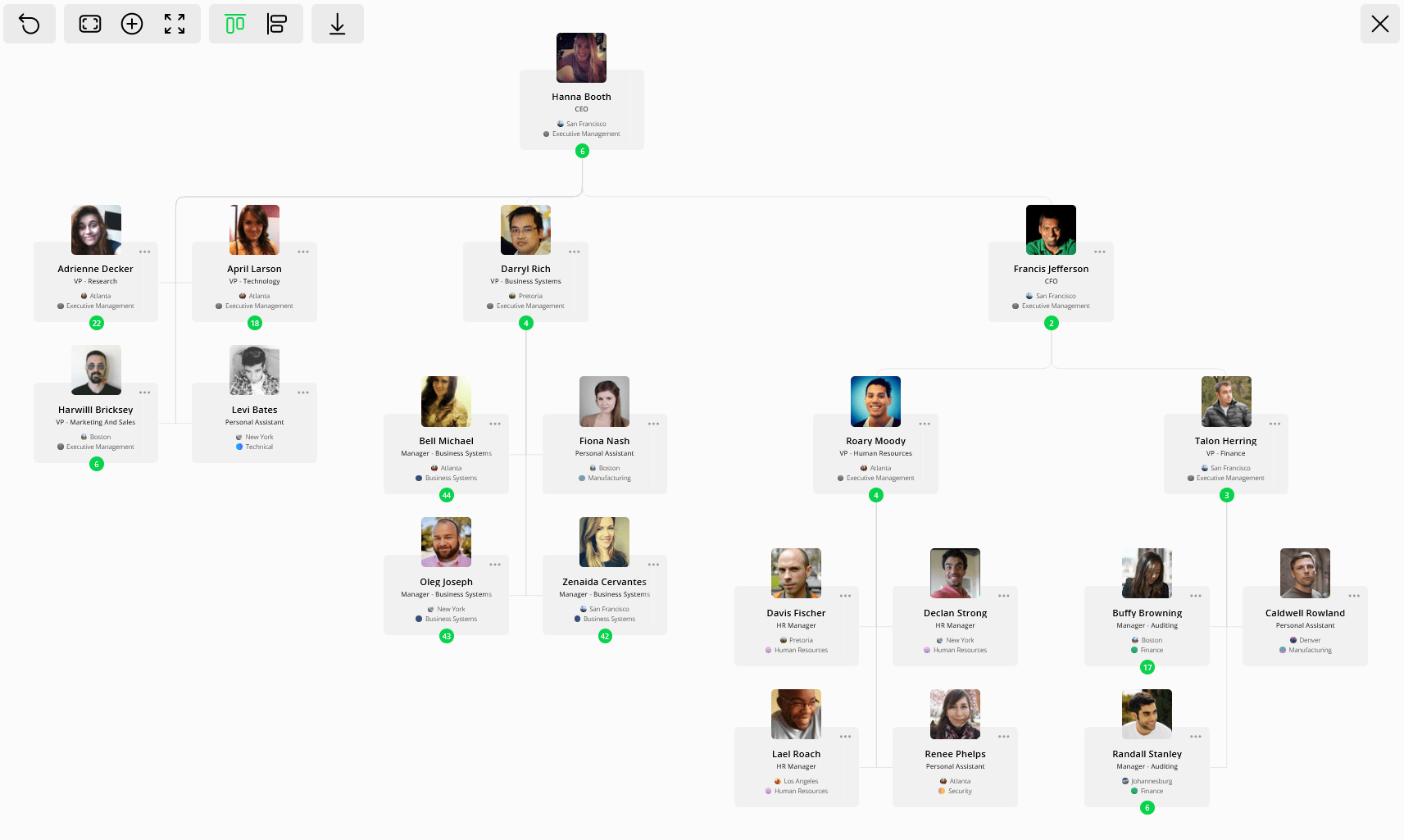
A PowerPoint or Visio organigram goes out of date the day someone changes manager. Nothing connects the diagram to the source data. OneDirectory's org chart software reads the manager relationship from Microsoft 365 directly. The diagram changes when the directory changes.
It also opens from any person rather than the top. Given that 1.7% figure, that matters. The view people reach for is the local one.
Worth saying who this is not for. A single-office team of thirty does not need software to know who reports to whom. A slide serves them better. The case for automating starts when reporting changes per quarter outrun the number of times anyone will redraw the thing.
Frequently Asked Questions
Is it spelled organigram or organogram?
Both are correct and both mean the same diagram. "Organigram" comes from the French organigramme and is more common in Europe. "Organogram" is more common in the UK, India and South Africa. In the United States the same diagram is almost always called an org chart.
What is the difference between an organigram and an org chart?
Usually none. Organigram, organogram and org chart all describe a diagram showing reporting lines and how teams are structured. "Org chart" is simply the more common wording online.
What are dotted lines in an organigram?
Dotted lines show a secondary reporting relationship, for example project work, shared services support, or regional oversight. Solid line = direct manager. Dotted line = secondary or project.
Why is my organigram missing people?
Almost always because the manager field is empty for those employees. An organigram is drawn from that field, so anyone without a manager cannot be placed under one. Across 65 Microsoft 365 tenants measured at first sync, the manager field was populated for 42% of employees.
Can you build an organigram automatically from Microsoft 365?
Yes. Microsoft Entra ID stores a manager relationship for each user, readable through Microsoft Graph, and org chart software reads that relationship to draw the diagram. Accuracy depends entirely on how completely that field is filled in.
How often should an organigram be updated?
Update it whenever someone is hired, leaves, changes manager, or is promoted. A fixed review cadence is a fallback rather than a fix: the reason charts lose trust is the gap between a change happening and the diagram showing it, so shortening that gap matters more than the review interval.
What tools can you use to create an organigram?
- PowerPoint or Google Slides: quick and clean visuals, manual to maintain
- Visio, Lucidchart or draw.io: better diagram control, still manual
- OneDirectory: draws the organigram from your existing employee data and updates as that data changes
Sources and corrections
Published 7 December 2023. Rewritten and fact-checked 16 August 2026.
Two corrections were made in this revision, both to citations that did not hold up:
- Removed a claim attributed to MIT Sloan Management Review stating that studies show visual models improve comprehension and team cohesion. The linked article is real, but it is about balancing managerial authority against employee autonomy and cites no such studies. The attribution was wrong and the sentence is gone.
- Removed a claim introduced as "According to Harvard Business Review". The source was a 2011 opinion column by an executive coach, not HBR research, and presenting it as a finding overstated it.
First-party figures here come from two OneDirectory studies of the same 65 customer organizations. The first is the April 2026 baseline, measured at each tenant's first Microsoft 365 sync. The second is product analytics covering 16,267 employees over the 90 days to 14 August 2026, excluding guest accounts, service accounts, shared mailboxes and disabled accounts. Both are described in full in Employee Directory and Org Chart Statistics 2026. These figures may be cited with attribution.
About the author
Greg Bennett is COO at OneDirectory. He has spent over ten years working on automated org chart software and employee directories for Microsoft 365 organizations. The measurements on this page come from the customer dataset he oversees. He writes at onedirectory.com/blog and can be found on LinkedIn.
Questions about these figures, or about mapping a structure a single manager field cannot express, go to the OneDirectory team.