What Is an Organizational Chart? The Complete Guide
Learn what an organizational chart is, how it visualizes your organizational structure and reporting lines, and which dynamic org chart software to use, step-by-step

An organizational chart is a visual map of who reports to whom in your company.
This guide covers the types, the limitations nobody designs around, how to build one, and how org chart software keeps the chart accurate after everyone stops maintaining it.
This guide covers:
Definition: What is an Organizational Chart?
An organizational chart (or org chart) is a visual representation of your company's organizational structure and reporting lines. It shows who reports to whom, how departments connect, and where the chain of command runs, all in a single diagram.
An org chart is usually drawn as a tree: boxes represent people or roles, and lines connect them to show reporting relationships. The CEO sits at the top, with lines branching down to senior managers, their teams, and so on.
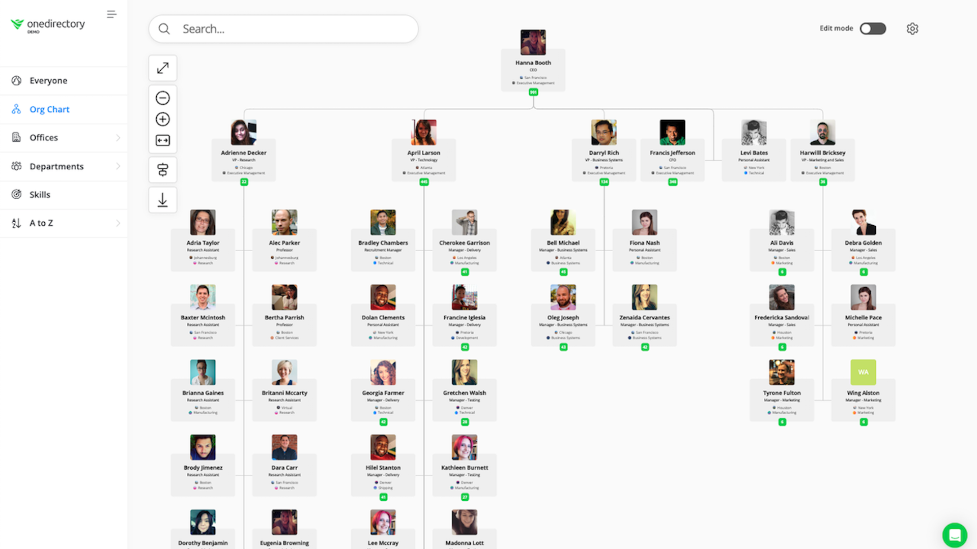
Think of it as the family tree of your company. A new hire joining Marketing can see where Marketing sits in the organization, who the Marketing Director is, who their teammates are, and how the team connects to other departments. Many HR teams hand out the org chart during onboarding for exactly this reason.
Primary Functions of an Organizational Chart
An effective org chart provides:
- Reporting clarity: shows who reports to whom.
- Chain of command: maps how authority flows from leadership to frontline teams. More in our guide to the chain of command.
- Span of control: shows how many direct reports each manager oversees. See span of control for how to read this.
- Departmental visibility: shows each department and its core responsibilities.
Strategic Functions of an Organizational Chart in 2026
Beyond structure, org charts serve broader business decisions:
- Workforce planning: spot gaps, overlaps, and inefficiencies in teams to guide hiring and restructuring.
- Budget alignment: use team sizes and reporting lines to inform how budgets are allocated across departments.
- Scenario planning: model future structures during growth, M&A, or leadership changes.
- Governance and compliance: document accountability in reporting relationships for audits and internal controls.
- Talent visibility: surface career paths and leadership pipelines for succession planning.
Other Names for Organizational Charts
Depending on your region, industry, or company culture, organizational charts go by different names. They all refer to a visual representation of your organizational structure, with slightly different emphasis:
- Organigram: common in Europe and formal documentation.
- Chain of command chart: emphasizes authority and military-style hierarchy.
- Hierarchy chart: common in traditional or legacy business structures.
- Organizational structure diagram: highlights the overall arrangement of departments and reporting lines.
- Hierarchy visualization: focuses on the visual representation of roles and levels.
- Management hierarchy: stresses the layers of managerial oversight.
Why Org Charts Still Matter in 2026
Most companies create an org chart once, circulate it, and let it rot. The companies that keep theirs alive use it for hiring decisions, reorgs, and onboarding, and their employees use it to find each other.
This shows up in organizations of every size.
A leading Premier League football club uses OneDirectory to manage an org chart across 100+ departments and 600+ employees, from coaching and academy teams to ticketing, retail, finance, and matchday safety. At that scale, a static org chart becomes unreliable within weeks. Automated org chart views give employees a live, accurate picture of how football and business operations connect.
Multipli Credit Union faced the same issue on a smaller scale. Their manual org chart was hard to maintain, not searchable, and missing contact information. After switching to an auto-syncing directory, staff could find the right person faster, and the team cut hours of admin work.
Whether you have 100 departments or 10, the problem starts with the data behind the chart, not the design.
Six jobs an org chart does
1. Clarify roles and responsibilities
An org chart makes it clear who does what and who reports to whom. That visibility reduces confusion around job duties, helps new hires understand where they fit, and reinforces accountability across the business.
2. Improve communication flow
Organizational charts reveal how communication flows, both vertically (manager to employee) and horizontally (team to team). A clearly mapped chart shows where a request starts, who approves it, and where it goes next.
3. Accelerate new hire onboarding
New employees see how the organization works and who's who, which means shorter onboarding, fewer basic structure questions landing on HR, and faster integration into team workflows.
4. Identify resource gaps
Your org chart surfaces red flags:
- Teams with too many direct reports
- Departments missing key roles
- Duplicated responsibilities across teams
One support manager carrying 14 direct reports while another carries 5 is invisible in a spreadsheet and obvious on a chart.
5. Support growth and change
As your business evolves, the chart is the blueprint: where new teams fit, where leadership layers are needed, and what a restructure actually changes.
6. Enhance strategic planning
Structure follows strategy, and the chart is where the two meet. It supports succession planning, budget forecasting based on team size, and organizational design discussions. During quarterly planning, a COO can read team headcounts straight off the chart.
Org Chart Limitations (and How to Overcome Them)
Org charts have three built-in blind spots. Relying on the chart alone creates communication silos, outdated assumptions, and missed opportunities.
1. They don't show informal relationships
Org charts show who reports to whom, not how people actually work together. Your senior engineer gives early product feedback directly to the product lead, skipping the reporting line entirely. None of that appears on the chart. Leaders overlook the cross-functional work, and it stays invisible.
2. They get outdated fast
Companies evolve. People leave, teams restructure, new roles emerge. Org charts stay frozen in time, and worse, they keep circulating as if they were accurate. Org chart updates get pushed to the bottom of the to-do list, and within weeks the chart is wrong.
The data underneath is usually worse than anyone assumes. In OneDirectory's research across 65 Microsoft 365 and Entra ID tenants, more than half of employees had no Manager field completed at first sync, which means their reporting line did not exist in the system at all. When manager data is absent, the chart built on top of it shows broken structures. Employees stop trusting what they see, and a chart nobody trusts gets ignored. The full numbers are in the data section below.
3. They reinforce silos and rigidity
Traditional org charts promote linear, top-down thinking. They rarely reflect lateral collaboration, shared responsibilities, or project-based work, and that can discourage people from working beyond their department.
How to overcome these limitations
Keep the org chart, and stop treating it as the whole story:
- Use a live, searchable employee directory to capture skills, responsibilities, and cross-team relationships.
- Use flexible org chart tools that reflect both hierarchy and collaboration.
- Visualize informal workflows where they matter, including dotted lines for secondary relationships.
- Update on a schedule: make org chart review part of quarterly planning, or use software that removes the manual step.
What the Data Shows About Org Charts in 2026
Most org chart conversations focus on the visible layer: layout, design, tools. The bigger issue sits underneath, in the employee data.
OneDirectory measured employee profile data across 65 Microsoft 365 and Entra ID customer tenants, covering more than 30,000 employee profiles. The first measurement captures each tenant's untouched state at first sync, before any cleanup: the data any org chart tool would inherit on day one.
At first sync, the average employee profile is 30.8% complete. Name and email are usually filled in. The fields that make an org chart useful (manager, department, job title, location, photo) are missing, outdated, or inconsistent.
The biggest gap is the Manager field. At first sync, only 42% of employees have one. More than half the workforce has no reporting line in the system, so no tool can build an accurate hierarchy from it. The structure simply is not there.
Photos and contact data follow the same pattern: 27% of organizations start with profile photos for most staff, and 1 in 5 starts with complete contact information.
An org chart is only as useful as the data behind it.
The same 65 tenants, measured again after a period of directory use, tell the second half of the story: manager coverage rose from 42% to 79%, and the share of directory-ready organizations rose from 33% to 61%. OneDirectory does not claim to have caused the improvement. The defensible reading is narrower: organizations that deployed a directory improved their people data, and the improvement clustered in fields a directory surfaces and an admin can bulk-fix. Both studies are published in full: the first-sync benchmark and the follow-up.
Before rebuilding your org chart, audit the five fields that matter most: manager, department, job title, location, and profile photo. Here's what to check for each.
Types of Organizational Charts
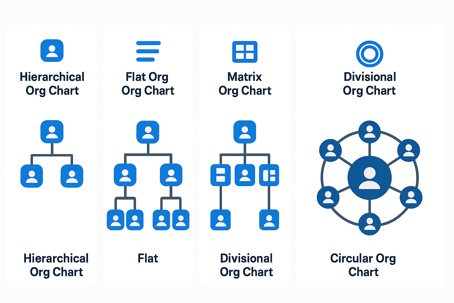
Organizational charts come in different formats, each reflecting a different way of thinking about hierarchy, communication, and collaboration. The right one depends on your company's size, structure, and goals.
1. Hierarchical org chart
The classic top-down model: leadership at the top, authority flowing downward through layers of management.
Best for: traditional companies, clear reporting lines, structured decision-making.
2. Flat org chart
A minimal-layer structure that reduces middle management and pushes decisions to employees.
Best for: startups, lean teams, cultures that value agility and transparency.
3. Divisional org chart
Organizes employees by product, region, or business unit, with each division operating semi-independently.
Best for: large companies with diverse offerings or multiple geographic markets.
4. Matrix org chart
Employees have dual reporting lines, usually to a department manager and a project or product lead.
Best for: project-driven organizations and teams that collaborate across functions.
5. Circular org chart
A non-linear chart that places leadership at the center with teams radiating outward in rings, emphasizing collaboration over hierarchy.
Best for: organizations focused on shared responsibility and communication flow.
How to Create an Org Chart (Process + Best Practices)
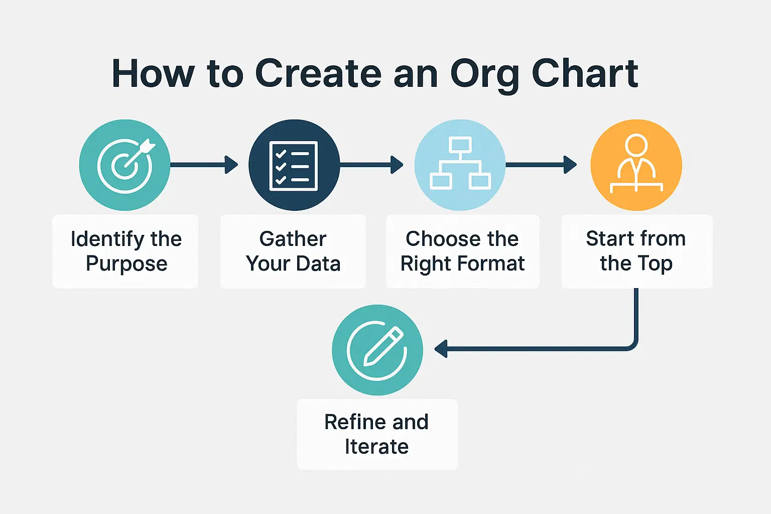
Creating an organizational chart is easier if you break it into steps:
- Define the scope and purpose. Decide what your org chart will cover (the whole company or one department) and why you're creating it (internal reference, onboarding, planning a reorganization). This determines how much detail you need.
- Gather your organizational data. Compile a list of all roles and employee names, along with who each role reports to. Use your HR records or employee directory so the data is accurate and current. You want a clear hierarchy list before you start drawing.
- Choose your creation method (manual vs. software). Select the format that fits your structure (hierarchical is most common; matrix fits dual-report setups). Then pick a tool. For a small organization, familiar software like Microsoft PowerPoint or Visio works, or an online tool like Lucidchart. For a larger org, or a chart that has to stay current, use dedicated software: OneDirectory's org chart software generates your chart automatically from your Microsoft 365 data and keeps it up to date in real time.
- Design and customize your chart. Start with the top leader, add their direct reports beneath them, and continue layer by layer. Draw lines from managers to their reports. Group people by team or department. As you build, check the chart against the list from step 2.
- Refine and maintain it. Align boxes, space the levels, keep names readable. Share the chart with your team via the intranet or onboarding materials. Then plan for maintenance: whenever someone joins, leaves, or changes roles, the chart needs the update. If you use a synced tool, these updates happen automatically.
Building Blocks of an Org Chart
To make your org chart usable and insightful, include:
- Leadership layer: executives and key decision-makers who set strategy and direction.
- Departmental pillars: functional areas like Marketing, Sales, HR, and IT, each with an accountable leader.
- Teams and units: smaller working groups under each department, with their leads.
- Roles and responsibilities: titles, duties, and reporting relationships at each level.
- Support staff: administrative and operational roles, the roles the chart usually forgets.
- Cross-functional links: dotted lines or visual cues for collaboration between departments.
- Communication flow: arrows or layout direction to show how decisions move through the business.
Org Chart Tools: Manual vs Modern
Whether you need a dynamic org chart that reflects updates in real time or a live chart and directory you can change on the fly, the tool decides whether your structure stays current.
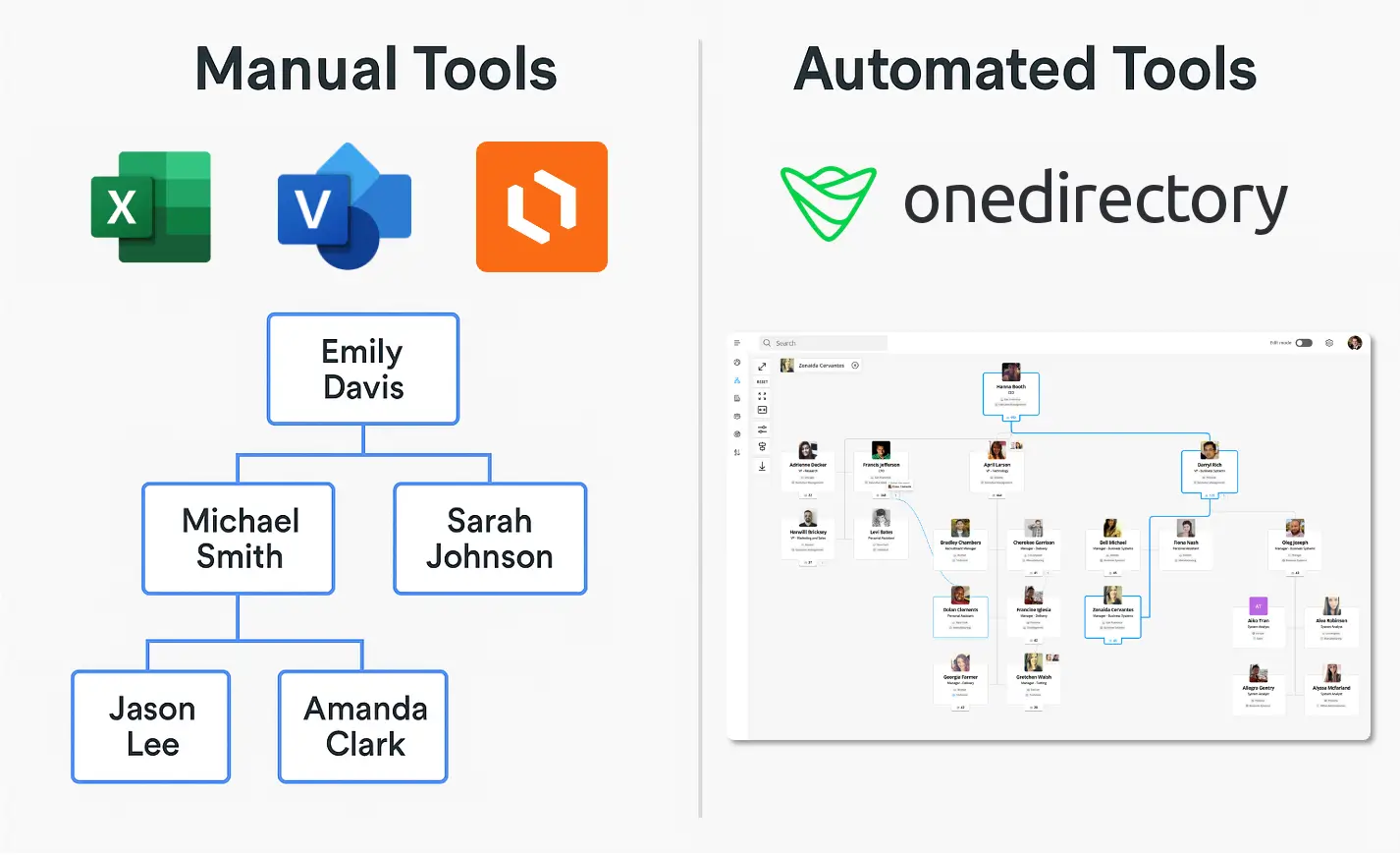
There are three main types of org chart tools:
| Type | Best for | Pros | Cons |
|---|---|---|---|
| Manual Org Chart Builders | Small teams, one-off presentations | Simple to use, high design control | Time-consuming to update, not scalable |
| Static Org Chart Software | Mid-sized teams, occasional updates | Templates, easy drag-and-drop, export options | Manual updates needed, no live data integration |
| Interactive Automated Org Chart Software | Growing or hybrid teams needing live org visibility | Real-time updates, searchable, reflects complex structures | Higher setup effort, typically paid |
How to Build Your Chart with Org Chart Software
Depending on your tech stack and needs, here are the main ways to build your organizational chart:
✅ OneDirectory
An interactive org chart and employee directory tool designed for Microsoft 365. Automatically syncs your employee data, shows real-time updates, and enriches profiles with photos, job info, and reporting lines.
- Get started: log in, sync your Microsoft 365 data, choose your starting point, done.
- Best for: interactive org charts, a modern employee directory, and remote or hybrid teams.
→ Compare the top org chart software tools
Other common org chart tools:
- Microsoft Visio: professional-grade tool for complex diagrams, with templates and deep customization. How to build an org chart in Microsoft Visio
- Microsoft PowerPoint: easy for presentations, using hierarchy SmartArt and design tools. How to build an org chart in PowerPoint
- Lucidchart: drag-and-drop diagramming with real-time collaboration. How to automatically build an org chart in Lucidchart
- Microsoft Entra ID (formerly Azure AD): for IT teams syncing org data with identity management. How to set up your org chart in Entra ID
Maximizing the Value of Your Org Chart
Creating the chart is the beginning. The value comes from it being practical, accessible, and actually used.
Choose the right tool
Use a platform that mirrors the real complexity of your organization, including dotted-line reports, cross-functional teams, and changing structures. Tools like OneDirectory sync with Microsoft 365 and reflect live org changes.
Make it visible and accessible
Your org chart shouldn't live in a static PDF buried in someone's inbox. Host it where employees can reach and search it: the intranet, onboarding materials, your HR tools.
Keep it continuously updated
An outdated org chart causes more confusion than clarity. New hires, departures, title changes, and team shuffles can make a chart irrelevant in weeks unless it has a live connection to your source of truth. Make updates part of the HR workflow, or use auto-syncing software and remove the manual step.
Make it easy to use and share
Finding someone on the chart should take seconds. Can employees search by name or department? Can they see roles, contact info, and reporting lines? Is it as smooth on a phone? If it's clunky, they stop using it.
Frequently Asked Questions: Org Charts
What should an org chart include?
A good org chart includes:
- Job titles and employee names (or just roles if preferred)
- Clear reporting lines (who reports to whom)
- Departmental groupings
- Leadership hierarchy
- Optional: contact info, photos, locations, dotted-line relationships
Who creates the org chart in a company?
Org charts are typically created by:
- HR teams – for onboarding, workforce planning, and internal clarity
- Operations or administrative staff – to maintain structure across teams
- People managers – when mapping out team-specific structures
In modern organizations, automated org chart software (like OneDirectory) often handles creation and updates via real-time data syncing.
What is the best tool for org charts in Microsoft 365?
For Microsoft 365 users, OneDirectory is the top choice. It:
- Integrates directly with your Microsoft 365 data
- Automatically updates with role or team changes
- Provides searchable, interactive org charts
How often should we update our organizational chart?
Update your org chart whenever changes occur, such as new hires, promotions, or team restructuring. Ideally, review it quarterly at minimum. Automated org chart software updates continuously, ensuring real-time accuracy. Never let your chart go untouched for more than a few months.
Can an org chart show multiple reporting lines (dotted-line relationships)?
Yes. Org charts typically use solid lines for primary reporting (direct managers) and dotted lines for secondary or matrix relationships. For example, an engineer might report directly to an Engineering Manager (solid line) but also collaborate closely with a Project Lead (dotted line).
What if our company is too large to fit on one org chart?
Large companies typically break down their org charts by divisions or departments. A common approach is to have a high-level chart for executives and key departments, with separate charts for each division. Interactive org chart tools allow navigation through multiple levels instead of relying on a single static view.
Ready to Turn Structure into Strategy?
Your org chart is already sitting in your employee data. OneDirectory reads it, renders it, and keeps it accurate as your company changes, with a complete employee directory built in.
Start your free trial or see OneDirectory's org chart software in action.