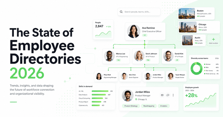
5 Missing Employee Data Fields That Quietly Break Your Org Chart
Your org chart is only as useful as the employee data behind it. Learn the five missing data fields that make org charts unreliable, outdated, and harder to trust.
Most companies assume their org chart problem is a design problem.
It looks dated. It is hard to navigate. People cannot find the right colleague. Reporting lines are unclear. Teams feel disconnected from the structure on the screen.
So the obvious fix seems to be a redesign. A cleaner layout. Better colours. A new tool. A more modern interface.
Those things can help, but they will not fix the real issue if the data underneath the org chart is incomplete, inconsistent, or out of date.
OneDirectory's analysis of real Microsoft 365 and Entra ID tenants found that:
- The average employee profile has only 30.8% of fields completed.
- Nearly 7 out of 10 profile fields are blank across a typical organisation.
- Only 1 in 3 organizations has what qualifies as "directory-ready" data (core fields filled in at 60% or above).
An org chart is only as useful as the employee data behind it. When people cannot trust what they see, they stop using it. And once that happens, the org chart becomes one of those internal systems that technically exists but does not help anyone day to day.
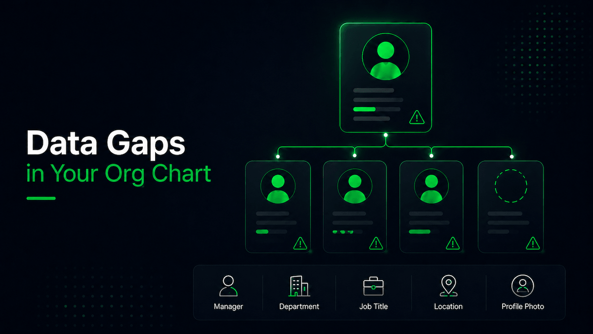
Before you rebuild or redesign your org chart, check these five employee data fields first.
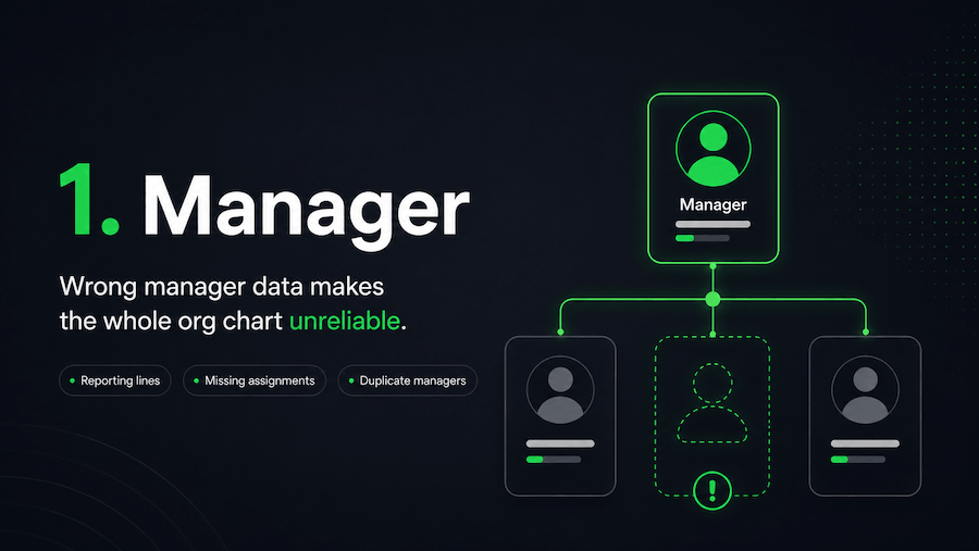
1. Manager data
Manager data is the backbone of every org chart.
If this field is wrong, the whole structure becomes unreliable.
Your org chart depends on accurate reporting lines. Employees need to see who reports to whom, where teams sit, and how leadership structures connect across the business.
The scale of the problem is larger than most HR and IT teams realise.
OneDirectory's analysis of Entra ID tenants found that only 42% of employees have their Manager field completed. That means more than half your organisation is missing a reporting line, and every org chart built on top of that data is showing an incomplete picture from the start.
When manager data is missing or incorrect, the problems show up quickly.
Employees appear under the wrong leader. New starters are unsure who manages them. HR teams spend time validating reporting lines manually. Leaders lose visibility into team structures. Approvals, escalations, and handovers become harder to follow.
And the issue is not just a messy chart.
It is a trust problem.
Once employees start questioning whether the org chart reflects the real business, they are less likely to use it when they need to find someone, understand a team, or work out where a decision should go.
If your organization uses Microsoft 365, this often starts with how manager and job information is maintained in Microsoft Entra ID.
What to check
Start with the basics:
- Are all employees assigned to the correct manager?
- Are there employees with no manager listed?
- Are any employees reporting to the wrong person?
- Are there duplicate or outdated manager records?
- Have recent team changes been reflected in the data?
Even one incorrect manager relationship can make the chart feel unreliable.
And when reporting lines are wrong, everything built on top of them becomes harder to trust.
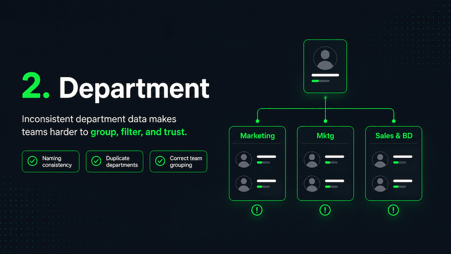
2. Department data
Department data helps people understand where someone sits in the business.
It also helps employees browse teams, filter people, and make sense of how the organization is structured.
But department data is often messier than companies realise, and the overall profile completeness figures suggest it rarely gets the attention it needs. With the average Entra ID profile sitting at 30.8% completion, department is one of the fields most likely to be inconsistent or missing entirely.
One system says “Marketing.”
Another says “Mktg.”
Another says “Brand & Growth.”
One team uses “Sales and Business Development.”
Another uses “Sales & BD.”
Each label may make sense on its own. But inside an org chart or employee directory, those small differences create confusion.
Employees may struggle to find the right team. Filters become less useful. Team groupings look inconsistent. Reporting views become harder to interpret.
For growing companies, this tends to get worse over time.
Every new team, region, system, acquisition, or restructure can introduce another naming variation. Eventually, your org chart stops showing a clean view of the business and starts showing a collection of inconsistencies that no one has had time to fix.
This is where your org chart and your wider organizational structure need to work together. If the data does not reflect how the business actually operates, the chart becomes harder to use.
What to check
Review your department data for:
- Inconsistent naming
- Duplicate departments
- Old department names
- Abbreviations that are not used consistently
- Employees assigned to the wrong team
- Departments that no longer exist
- Teams that should be grouped differently
The goal is not to create perfect department names.
The goal is to make them clear, consistent, and useful.
Employees should be able to look at the org chart and quickly understand how teams are structured. If they have to guess what a department name means, the data is already getting in the way.
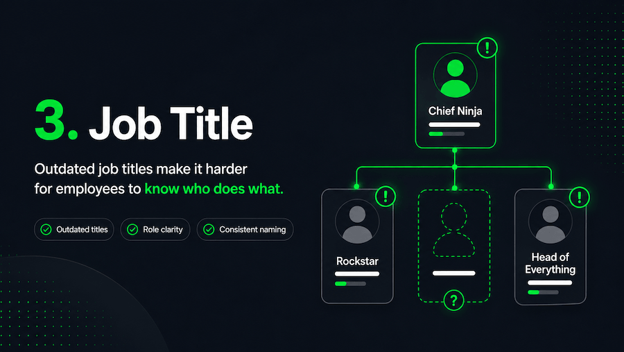
3. Job title
Job titles give people context.
They help employees understand what someone does, what they are responsible for, and whether they are the right person to contact.
When job titles are outdated or vague, the org chart becomes less useful.
This happens often in fast-moving companies. People change roles. Responsibilities shift. Teams restructure. Someone gets promoted. Someone takes on a new function. But their title in the employee directory stays exactly the same.
Over time, the org chart starts showing yesterday’s version of the company. Given that average profile completion sits below 31%, job title is frequently one of the fields that slips, updated in the HR system but never pushed through to Entra ID, or updated in Entra ID but not consistently formatted across teams.
That creates small but frustrating moments across the business.
Someone is trying to find the right person in Finance, but the titles do not make ownership clear. A new starter is trying to understand the leadership team, but the roles do not match how the business actually works. A manager is looking for a subject-matter expert, but the titles are too vague to be helpful.
The problem is not only the title itself.
It is the uncertainty it creates.
When employees cannot tell who does what, they waste time asking around, checking with colleagues, or contacting the wrong person.
Job titles are also one of the core fields that make an employee profile useful. Without accurate role context, the profile may exist, but it will not help people make quick decisions.
What to check
Look for:
- Outdated job titles
- Vague titles that do not explain the role
- Internal nicknames or informal titles
- Inconsistent naming across similar roles
- Employees whose responsibilities have changed
- Seniority levels that are unclear
- Titles that do not match HR or Microsoft 365 records
A job title does not need to explain every responsibility in detail.
But it should give enough context for someone to understand who the person is and why they might need to contact them.
A useful org chart does not just show names.
It helps people understand roles.
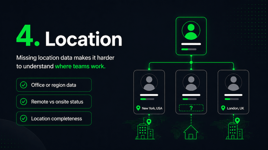
4. Location data
Location data matters more now than it used to.
Many employees no longer work from one shared office. They may be spread across regions, countries, time zones, remote teams, hybrid teams, and satellite offices.
That makes location data an important part of the employee experience.
If location is missing from your org chart, distributed teams become harder to understand.
Employees may not know who works in which office. They may struggle to find colleagues in the same region. Time zone differences become harder to manage. Remote employees can feel disconnected from the wider organisation.
Location gives people practical context.
It helps someone in London find the right colleague in New York. It helps a new starter understand where their team is based. It helps leaders see how teams are distributed. It helps employees connect with people near them, even if they work in different departments.
Without location data, your org chart becomes too flat.
It may show hierarchy, but it misses the geographic reality of how the business actually works.
This is one reason a modern employee directory needs more than names and contact details. It should help people understand teams, reporting lines, and locations in one place.
What to check
Review whether employee profiles include:
- Office location
- Region
- Country
- Time zone
- Remote or onsite status
- Hybrid work information
- Complete location data across all employees
For global and distributed companies, location is not a nice-to-have field.
It is part of how employees understand the organization.
An org chart should not only show who reports to whom. It should also help people understand where work is happening.
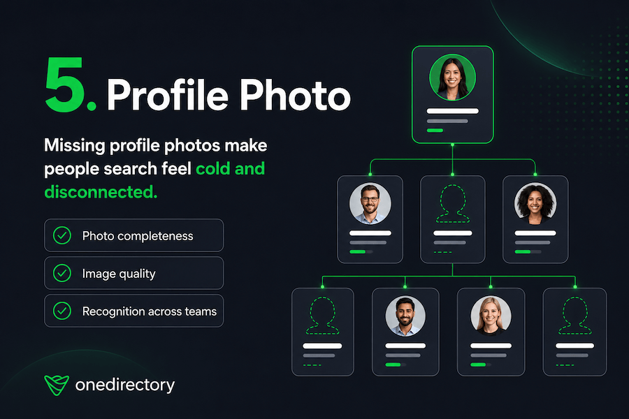
5. Profile photo
Profile photos may seem less important than manager, department, or job title data. But the numbers tell a different story about how widely they are actually missing.
OneDirectory's analysis found that only 27% of Entra ID tenants have profile photos filled in for 80% or more of their employees. In most organisations, the majority of staff appear as blank avatars in every Microsoft surface, Teams, Outlook, SharePoint, and every org chart built on top of that data.
A profile photo helps employees recognize people. It makes search results feel more personal. It helps new starters connect names to faces. It makes distributed teams feel less anonymous.
When profile photos are missing, the employee directory starts to feel cold.
People see blank icons instead of colleagues. They get uncertainty instead of recognition. The org chart feels like a system of records, not a view of real people.
This matters even more in remote and hybrid companies.
When employees do not see each other in person every day, small identity cues become more important. A clear profile photo can make someone feel familiar before the first meeting, message, or video call.
It also improves people search.
People are more likely to recognize the coworker they are looking for when a photo appears alongside their name, title, department, and location.
What to check
Audit your profile photos for:
- Missing photos
- Low-quality images
- Outdated photos
- Inconsistent image formats
- Generic placeholder images
- Photos missing from specific teams or regions
- Employees who are hard to recognise from their image
Profile photos are not just cosmetic.
They help turn an org chart from a hierarchy into a more human employee experience.
And that is what people actually need.
Where to start: fixing org chart data by priority
Fix these fields in order.
- Manager data first. It's the only field that determines the chart's structure. Wrong departments and vague titles make the org chart less useful. Missing manager data makes it wrong. With only 42% of employees having a completed Manager field in Entra ID, it's also where most organisations have the largest gap.
- Department data second. Once reporting lines are accurate, consistent department names let employees browse teams and filter by group. Inconsistent naming undermines that even when the hierarchy is correct.
- Job titles third. Accurate titles turn a list of names into a map of roles. Employees rely on them to find the right person quickly. Outdated titles mean they can't.
- Location and photos last. They matter, but they improve an org chart that already has structural integrity. Fixing them before manager and department data is treating the surface before the foundation.
Most org chart projects focus on the wrong constraint. Teams compare tools and debate layouts while the underlying data sits at 30.8% completion. A better interface can't fix that. The organizations with org charts employees actually trust aren't running the most sophisticated software. They treat profile data as something that needs to be owned and maintained, not exported from an HR system once and left to drift.
That gap: between tools that display data and platforms that keep it trustworthy, doesn't show up in a product demo. It shows up six months after launch.
How OneDirectory helps
OneDirectory helps organisations turn employee data into a clear, searchable, and easy-to-use employee directory and org chart.
Instead of relying on static charts or outdated spreadsheets, employees can explore the organisation through accurate employee profiles, reporting lines, departments, locations, job titles, and profile photos.
That means your org chart becomes more than a diagram.
It becomes a practical tool employees can use to understand who people are, where they sit, and how to connect with them.
With OneDirectory Org Chart Software, your org chart can stay connected to your Microsoft 365 employee data, so changes to people, teams, and reporting lines are easier to keep up to date.
When your people data is easier to trust, your org chart becomes easier to use.
And when your org chart is easier to use, employees are more likely to rely on it.
FAQ
What employee data is needed for an org chart?
The most important employee data fields for an org chart are manager, department, job title, location, and profile photo. These fields help define reporting lines, team structure, role clarity, geographic context, and employee recognition.
Why is my org chart inaccurate?
Your org chart may be inaccurate because the employee data behind it is incomplete, outdated, or inconsistent. Common causes include missing manager assignments, old job titles, duplicate departments, incorrect reporting lines, and incomplete employee profiles.
How do you improve org chart accuracy?
To improve org chart accuracy, start by auditing your employee data. Check manager relationships, department names, job titles, location fields, and profile photos. Once the data is clean and consistent, the org chart becomes easier to trust and maintain.
Why does manager data matter in an org chart?
Manager data defines the reporting structure of an org chart. If manager information is missing or incorrect, employees may appear in the wrong place, reporting lines become unreliable, and the overall chart becomes harder to trust.
Why are profile photos important in an employee directory?
Profile photos help employees recognise colleagues, especially in remote, hybrid, and distributed teams. They make employee search feel more personal and help people connect names to faces across the organisation.