Modern Organizational Charts: The Complete Guide
Learn what an organizational chart is, how it visualizes your organizational structure and reporting lines, and which dynamic org chart software to use, step-by-step

Organizational charts aren’t just internal diagrams, they’re visual maps of how your business operates.
This guide explores everything you need to know about modern org charts: from types, benefits, and limitations, to tools, building steps, and strategic uses.
Whether you're a team of 10 or 10,000, you'll find practical steps, examples, and tool comparisons to help you structure your company for clarity and connection.
This guide covers:
Definition: What is an Organizational Chart?
An organizational chart (or org chart) is a visual representation of your company’s organizational structure and reporting lines. It shows who reports to whom, how departments interface, and highlights your chain of command in a single diagram.
Typically, an org chart is drawn as a tree-like diagram with boxes representing individuals or roles and lines connecting them to show reporting relationships. For example, the CEO or top leader sits at the peak, with lines branching down to senior managers, their teams, and so on. In simplest terms, an org chart shows who reports to whom and how teams are organized.
The purpose of an org chart is to provide clarity and transparency. At a glance, anyone (employees or even outsiders) can understand how the company is structured and how different roles interrelate. It’s more than just boxes and lines, it’s a map of your organization’s working dynamics.
Primary Functions of an Organizational Chart
An effective org chart provides:
- Reporting Clarity – Clearly shows who reports to whom.
- Chain of Command – Maps how authority flows from leadership to frontline teams.
- Span of Control – Highlights how many direct reports each manager oversees.
- Departmental Visibility – Visualizes each department and its core responsibilities.
Whether you're a growing startup or a large enterprise, a well-structured organizational structure diagram helps ensure everyone understands where they fit and how your organization operates.
Strategic Functions of an Organizational Chart
Beyond structure, org charts also serve broader business objectives:
- Workforce Planning – Identify gaps, overlaps, or inefficiencies in teams to guide hiring and restructuring decisions.
- Budget Alignment – Visualize team sizes and reporting lines to inform how resources and budgets are allocated across departments.
- Scenario Planning – Model future org structures during periods of growth, M&A, or leadership changes.
- Governance & Compliance – Provide clarity and accountability in reporting relationships, which is critical for audits, regulations, and internal controls.
- Talent Visibility – Highlight potential career paths and leadership pipelines, aiding succession planning and employee development.
When used strategically, your org chart becomes more than a static diagram—it becomes a tool for driving smarter decisions across your business.
Other Names for Organizational Charts
Depending on your region, industry, or company culture, organizational charts may go by different names. While they all refer to a visual representation of your organizational structure, each term may emphasize a slightly different use case or cultural nuance.
Here are the most common alternatives:
- Organigram – Common in Europe and formal documentation.
- Chain of Command Chart – Emphasizes authority and military-style hierarchy.
- Hierarchy Chart – Often used in traditional or legacy business structures.
- Organizational Structure Diagram – Highlights the overall arrangement of departments and reporting lines.
- Hierarchy Visualization – Focuses on the visual representation of roles and levels.
- Management Hierarchy – Stresses the layers of managerial oversight within an organization.
Why Organizational Charts Matter
Organizational charts are more than just visual aids or office posters, they’re powerful tools that bring clarity, efficiency, and structure to your business.
Yet many companies create org chart diagrams once and forget about them. That’s a missed opportunity. When used well, org charts can drive alignment, surface inefficiencies, and support growth.
Here’s why org charts matter more than you might think:
1. Clarify Roles and Responsibilities
An org chart makes it immediately clear who does what and who reports to whom.
This visibility:
- Reduces confusion around job duties
- Helps new hires understand where they fit
- Reinforces accountability across the business
2. Improve Communication Flow
Organizational charts also reveal how communication flows through your organization, both vertically (manager-to-employee) and horizontally (team-to-team).
This helps:
- Minimize bottlenecks
- Clarify who should be in the loop
- Encourage efficient cross-department collaboration
3. Accelerate New Hire Onboarding
New employees can quickly understand how the organization works and who’s who.
This leads to:
- Shorter onboarding times
- Less reliance on HR to answer basic structure questions
- Faster integration into team workflows
4. Identify Resource Gaps
By analyzing your organizational chart, you can spot red flags like:
- Teams with too many direct reports
- Departments missing key roles
- Duplicated responsibilities across teams
This insight helps guide hiring decisions, reassignments, and org restructuring before issues snowball.
5. Support Growth and Change
Organizational charts act as blueprints for scaling. As your business evolves, your chart helps you:
- Visualize where new teams fit
- Plan leadership layers
- Restructure efficiently
6. Enhance Strategic Planning
Use your org chart to align structure with business goals and growth strategy.
It supports:
- Succession planning
- Budget forecasting based on team size
- Organizational design discussions
Org Chart Limitations (and How to Overcome Them)
Organizational charts are a powerful way to clarify structure, but they're not perfect.
Most leaders assume that if they’ve nailed the boxes and lines, their business will run like clockwork. But that assumption can lead to blind spots.
The truth is: org charts have serious limitations, and relying on them alone can create communication silos, outdated assumptions, and missed opportunities.
Let’s look at the key limitations, and what to do instead.
1. They Don’t Show Informal Relationships
Org charts show who reports to whom, but they don’t capture how people actually work together.
💡 Real-world example:
Mark in Sales reports to Sarah, and Sarah reports to the CEO. But Mark often collaborates directly with Tanya in Product, bypassing Sarah to give early feedback on new features.
The org chart? Completely unaware.
The result? Leaders overlook important cross-functional dynamics, and unofficial collaboration stays invisible.
2. They Get Outdated... Fast
Companies evolve quickly. People leave, teams restructure, new roles emerge.
But org charts? They often stay frozen in time.
Within weeks, they’re misaligned, and worse, they keep circulating as if they’re accurate.
📉 This leads to:
- Confusion for new hires
- Frustrated managers
- Miscommunication across departments
And let’s be honest: most org chart updates get pushed to the bottom of the to-do list.
3. They Reinforce Silos and Rigidity
Traditional org charts promote linear, top-down thinking, great for organizational structure, but not for flexibility.
They rarely reflect:
- Lateral collaboration
- Shared responsibilities
- Agile or project-based work
This can unintentionally discourage employees from stepping outside their lane or collaborating beyond their department.
How to Overcome Org Chart Limitations
You don’t need to throw out your org chart. Just don’t treat it as the whole story.
Instead, supplement your chart with dynamic tools and real-world context.
Here’s how:
Use a live, searchable employee directory
Highlight skills, responsibilities, and cross-team relationships.
Embrace flexible org chart tools
Use software that reflects both hierarchy and collaboration (like OneDirectory 😉).
Visualize informal workflows
Show how real communication flows, not just formal reporting lines.
Update regularly
Make org chart reviews part of quarterly planning.
Structure matters, but culture, collaboration, and communication make the structure work.
Types of Organizational Charts
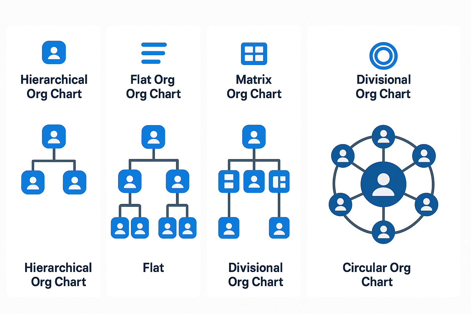
Organizational charts come in different formats, each reflecting a unique way of thinking about hierarchy, communication, and collaboration. Choosing the right one depends on your company’s size, structure, and strategic goals.
According to McKinsey’s insights on organizing for the future, successful companies frequently rethink their structures to boost agility and efficiency.
Below are the most common types of org charts, including a newer, more modern option:
1. Hierarchical Org Chart
The classic top-down model, where leadership sits at the top and authority flows downward through layers of management.
Best for: Traditional companies, clear reporting lines, and structured decision-making.
2. Flat Org Chart
This minimal-layer structure reduces middle management and empowers employees to make decisions autonomously.
Best for: Startups, lean teams, and cultures that value agility and transparency.
3. Divisional Org Chart
Organizes employees by product, region, or business unit, with each division operating somewhat independently.
Best for: Large companies with diverse offerings or multiple geographic markets.
4. Matrix Org Chart
Employees have dual reporting lines, typically to both a department manager and a project or product lead.
Best for: Project-driven organizations and teams that collaborate across functions.
5. Circular Org Chart
A modern, non-linear chart that places leadership at the center and visualizes teams radiating outward in rings. It emphasizes collaboration and connectivity over hierarchy.
Best for: Progressive organizations focused on inclusion, shared responsibility, and communication flow.
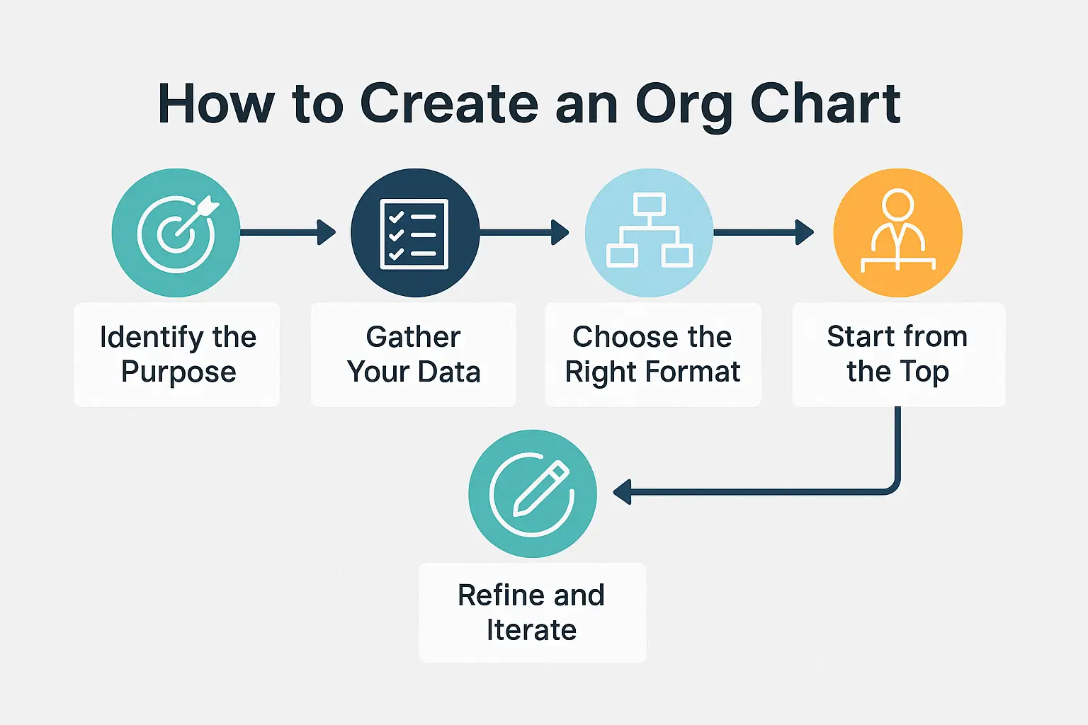
How to Create an Org Chart (Process + Best Practices)
Creating an organizational chart is much easier if you break it into steps. Here’s a straightforward process:
- Define The Scope and Purpose
Decide what your org chart will cover (the whole company or just a specific department?) and why you’re creating it (e.g. for internal reference, for onboarding, or to plan a reorganization). This will determine how much detail you need. - Gather Your Organizational Data
Compile a list of all roles and employee names, along with who each role reports to. Use your HR records or employee directory to ensure the data is accurate and up-to-date. Essentially, you want a clear hierarchy list before you start drawing the chart. - Choose Your Org Chart Creation Method (Manual vs. Software)
Select the org chart format that fits your structure (hierarchical is most common, but matrix might fit a dual-report setup). Then pick a tool to create it. For a small organization, you could use familiar software like Microsoft PowerPoint or Visio, or an online tool like Lucidchart. For a larger org or an always-updated chart, consider dedicated org chart software. For example, OneDirectory’s org chart software can generate your chart automatically from your HR or Microsoft 365 data (so it stays up-to-date in real time). - Design and Customize Your Org Chart
Start plotting with the top leader at the top (or center), then add their direct reports beneath (or around) them. Continue adding each layer of the hierarchy. Draw lines from managers to their subordinates to show the reporting links. Group individuals by team or department for clarity. As you build, double-check that the structure on the chart matches the list you compiled in step 2. - Refine and Maintain Your Org Chart
Adjust the layout to make it easy to read – align boxes, evenly space levels, and ensure names/titles aren’t cramped. Once it looks clear, share the org chart with your team (for example, via the intranet or as part of your onboarding materials). Finally, plan to keep the chart updated. Whenever someone new joins, someone leaves, or roles change, update the org chart accordingly. If you use an interactive or synced tool, these updates might happen automatically. Regular maintenance ensures your org chart remains accurate and trusted.
Building Blocks of an Org Chart
To make your org chart both usable and insightful, be sure to include:
- Leadership Layer
Executives and key decision-makers (CEO, CFO, CTO, board members) who set strategy and direction. - Departmental Pillars
Functional areas like Marketing, Sales, HR, IT, each with a leader accountable for performance. - Teams and Units
Smaller working groups under each department. Show who leads them and what they do. - Roles and Responsibilities
Clearly define titles, duties, and reporting relationships at each level. - Support Staff
Don’t overlook administrative and operational roles, these are the gears that keep the business running. - Cross-Functional Links
Use dotted lines or visual cues to show collaboration between departments or shared responsibilities. - Communication Flow
Arrows or layout direction can subtly show how decisions and updates flow through the business.
Org Chart Tools: Manual vs Modern
Whether you need a dynamic org chart that automatically reflects real-time updates or a live org chart and employee directory that lets you collaborate and make changes on the fly, choosing the right software is key to keeping your team aligned and your structure current.
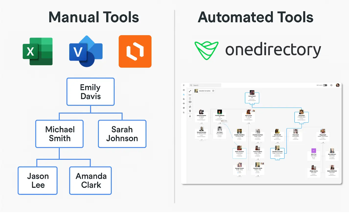
There are three main types of org chart tools, each with pros and cons depending on your organization’s needs, size, and tech stack:
| Type | Best for | Pros | Cons |
|---|---|---|---|
| Manual Org Chart Builders | Small teams, one-off presentations | Simple to use, high design control | Time-consuming to update, not scalable |
| Static Org Chart Software | Mid-sized teams, occasional updates | Templates, easy drag-and-drop, export options | Manual updates needed, no live data integration |
| Interactive Automated Org Chart Software | Growing or hybrid teams needing live org visibility | Real-time updates, searchable, reflects complex structures | Higher setup effort, typically paid |
Need an Interactive & Automated Org Chart for Your Entire Company?
Get real-time visibility into your team structure and streamline collaboration across every department with OneDirectory.
How to Build your Chart with Org Chart Software
Depending on your tech stack and needs, here are several ways to build your organizational chart:
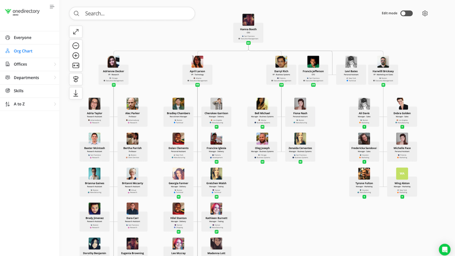
✅ OneDirectory (Recommended)
An interactive org chart and employee directory tool designed for Microsoft 365. Automatically syncs your employee data, shows real-time updates, and enriches profiles with photos, job info, and reporting lines.
- Get started: Log in, sync your Microsoft 365 data, choose your starting point and you're done.
- Best for: Interactive org charts, modern employee directory, employee profile exploration, and remote or hybrid teams.
→ See how OneDirectory works
Other Common Org Chart Tools:
- Microsoft Visio
Professional-grade tool for complex diagrams. Offers templates, drag-and-drop shapes, and deep customization.
→ How to build an org chart in Microsoft Visio - Microsoft PowerPoint
Easy for presentations—build org charts using hierarchy SmartArt and design tools. Ideal for meetings.
→ How to build an org chart in Microsoft PowerPoint - Lucidchart
A user-friendly drag-and-drop diagramming tool with real-time collaboration. Integrates well with Google Workspace and Microsoft.
→ How to automatically build an org chart in Lucidchart - Microsoft Entra ID (formerly Azure AD)
For IT teams looking to sync org data with identity and access management. Ideal for security-minded orgs or complex enterprise needs.
→ How to set up your org chart in Entra ID
Maximizing the Value of Your Org Chart
Creating an org chart is just the beginning. To unlock its full potential, you need to ensure it's practical, accessible, and actively used across your organization.
Here’s how to get the most value from your org chart:
Choose the Right Tool
Use an org chart platform that mirrors the real complexity of your organization, including dotted-line reports, cross-functional teams, and changing structures. Bonus points if it integrates with your HR or directory data for real-time updates.
🛠 Tools like OneDirectory automatically sync with Microsoft 365 and reflect live org changes.
Make It Visible and Accessible
Your org chart shouldn’t live in a static PDF buried in someone’s inbox.
Host it somewhere employees can quickly access and search, whether they’re onboarding, collaborating cross-functionally, or trying to understand how decisions flow.
- Add it to your intranet or internal knowledge hub
- Share it in onboarding materials
- Link it in your email signatures or HR tools
Keep It Continuously Updated
An outdated org chart causes more confusion than clarity.
New hires, departures, title changes, and team shuffles can make your chart irrelevant in weeks—unless you’ve got a live connection to your source of truth.
Make org chart updates part of your HR workflow or use auto-syncing software to stay current without manual edits.
Make It Easy to Use and Share
It should take seconds—not minutes—to find someone on your org chart.
Ensure your chart includes search, filters, and profile previews so employees don’t just look at it—they use it.
- Can employees search by name or department?
- Can they view roles, contact info, and reporting lines?
- Is the mobile experience just as smooth?
If it’s clunky, they’ll stop using it.
Think of your org chart as a living tool, not a one-and-done graphic.
Design it, test it, improve it, and gather feedback from employees on what they actually need from it.
The more useful it becomes, the more embedded it will be in your culture.
Frequently Asked Questions: Org Charts
What should an org chart include?
A good org chart includes:
- Job titles and employee names (or just roles if preferred)
- Clear reporting lines (who reports to whom)
- Departmental groupings
- Leadership hierarchy
- Optional: contact info, photos, locations, dotted-line relationships
Who creates the org chart in a company?
Org charts are typically created by:
- HR teams – for onboarding, workforce planning, and internal clarity
- Operations or administrative staff – to maintain structure across teams
- People managers – when mapping out team-specific structures
In modern organizations, automated org chart software (like OneDirectory) often handles creation and updates via real-time data syncing.
What is the best tool for org charts in Microsoft 365?
For Microsoft 365 users, OneDirectory is the top choice. It:
- Integrates directly with your Microsoft 365 data
- Automatically updates with role or team changes
- Provides searchable, interactive org charts
How often should we update our organizational chart?
Update your org chart whenever changes occur, such as new hires, promotions, or team restructuring. Ideally, review it quarterly at minimum. Automated org chart software updates continuously, ensuring real-time accuracy. Never let your chart go untouched for more than a few months.
Can an org chart show multiple reporting lines (dotted-line relationships)?
Yes. Org charts typically use solid lines for primary reporting (direct managers) and dotted lines for secondary or matrix relationships. For example, an engineer might report directly to an Engineering Manager (solid line) but also collaborate closely with a Project Lead (dotted line).
What if our company is too large to fit on one org chart?
Large companies typically break down their org charts by divisions or departments. A common approach is to have a high-level chart for executives and key departments, with separate charts for each division. Interactive org chart tools allow navigation through multiple levels instead of relying on a single static view.
Ready to Turn Structure into Strategy?
A modern org chart isn’t just a diagram, it’s a living, breathing reflection of how your business works. From clarifying roles to identifying gaps and supporting company-wide growth, org charts help teams move with clarity and confidence.
Whether you're navigating rapid change, scaling your team, or just trying to get everyone on the same page, the right org chart can be your biggest ally.
Don’t just build an org chart.
Build a smarter, more connected organization.
→ Try OneDirectory free and start visualizing your team like never before.