How to Make an Org Chart in Excel (Step by Step)
Insert > SmartArt > Hierarchy > Organization Chart, then press Tab to set who reports to whom. Every step with screenshots, plus the three places Excel org charts break.

Excel can build a clean org chart in about four minutes.
The tool is SmartArt, it ships with desktop Excel, and it needs no add-ins or downloaded templates. This guide walks through every step with screenshots, then covers the three places an Excel org chart stops working, so you know when to switch to org chart software instead.
Quick answer: In Excel, go to Insert > SmartArt > Hierarchy > Organization Chart. Open the text pane with the small arrow on the left edge of the graphic, type one person per line, and press Tab to place each person under their manager. Shift+Tab moves them back up a level.
What you need before you start
- Desktop Excel (Microsoft 365, Windows or Mac). I built the sample chart in this guide in Excel for Mac.
- A list of names, job titles and who reports to whom. The sample uses invented names: one CEO, three department heads, two to four reports each, and one executive assistant.
- Not Excel for the web. I tried the browser version first. Its Insert tab has Pictures and Shapes but no SmartArt, and searching the ribbon for "SmartArt" returns nothing. Every step below needs the desktop app.
Step 1: Insert an Organization Chart from SmartArt
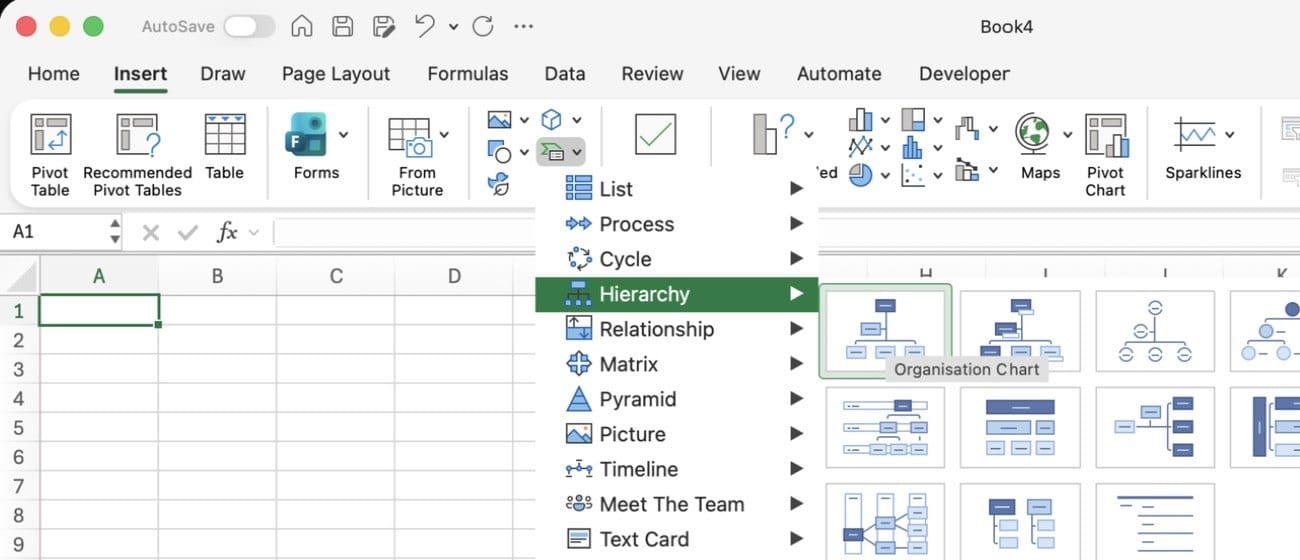
Open a blank sheet and go to Insert > SmartArt. Pick Hierarchy, then Organization Chart.
On Windows this opens a dialog, so you click OK. On the Mac build I used, SmartArt is a small icon on the Insert tab that opens a category menu, and clicking the thumbnail inserts the chart straight away. Either way, Excel drops in a starter chart with five boxes.
Step 2: Open the text pane instead of typing in the boxes
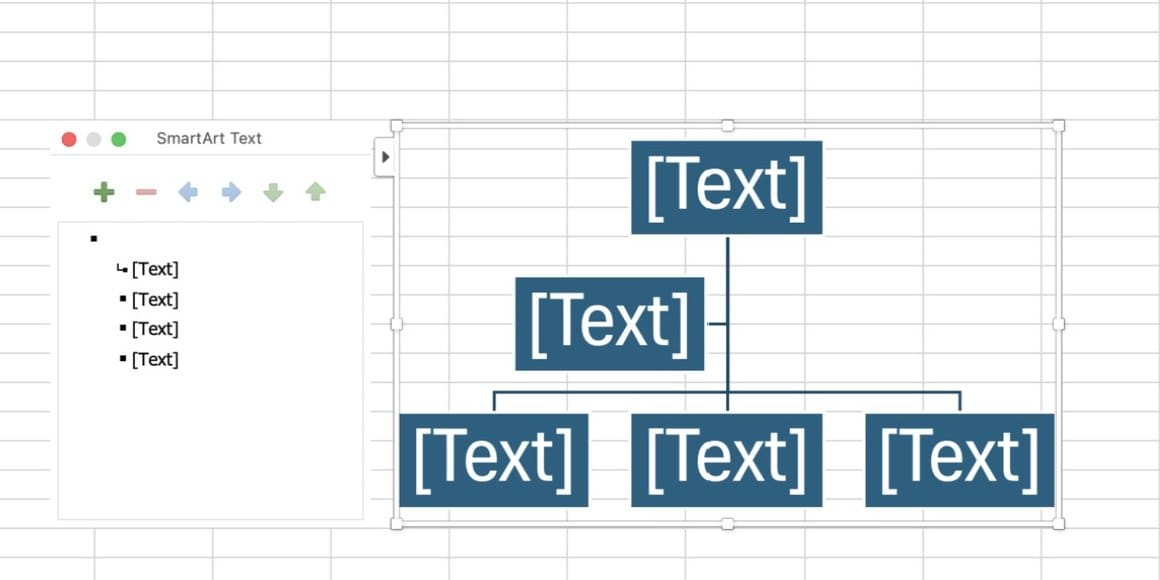
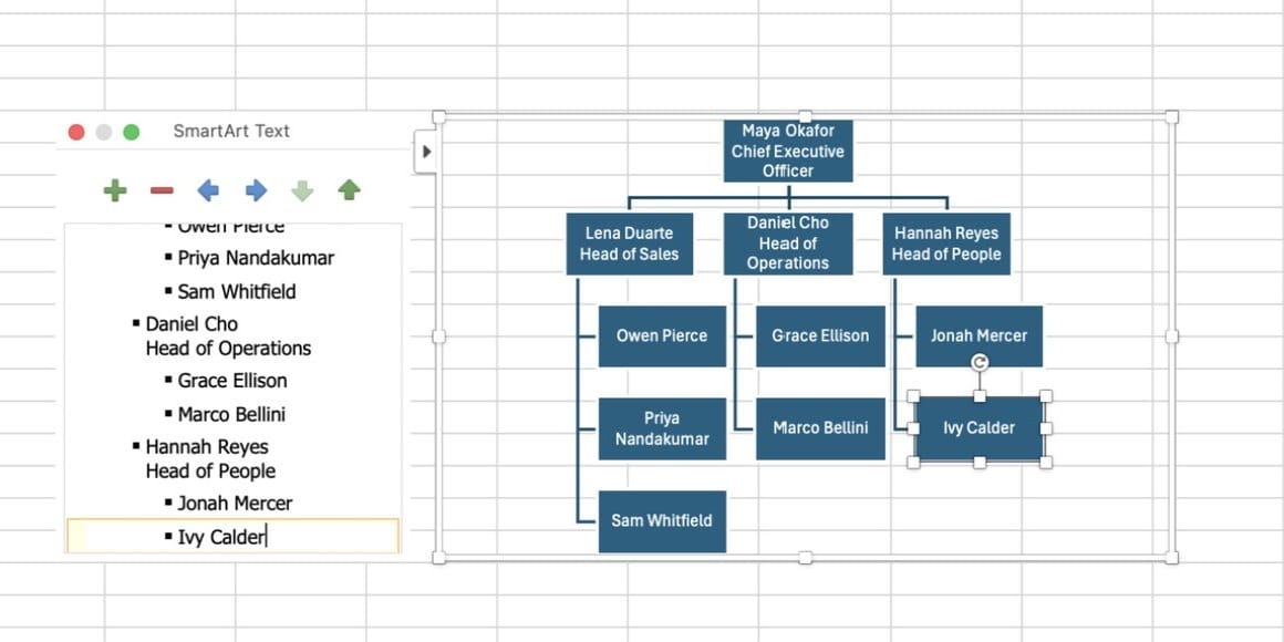
Do not type into the boxes directly. Click the small arrow on the left edge of the graphic to open the text pane.
The text pane is faster, and it is the only place you control who reports to whom. Each line is one box. Indentation is the reporting line.
Step 3: Type the top of the chart, then add a job title
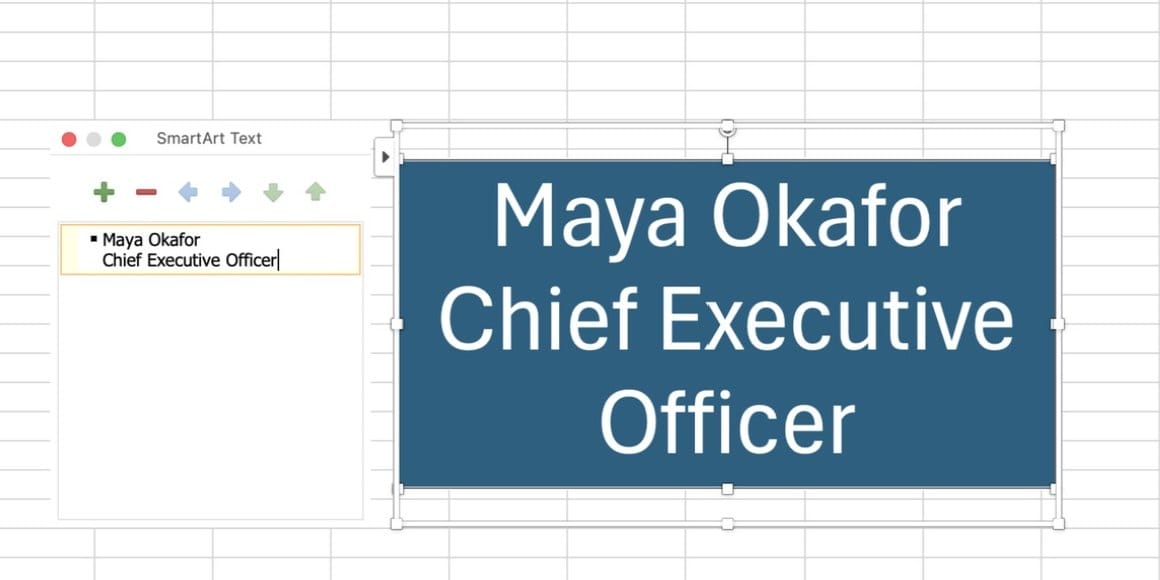
The first line is the top of your chart. Type a name, then press Shift+Enter to add a job title on a second line in the same box.
Step 4: Press Tab to say "reports to"
Press Enter for the next person. Press Tab and they move one level down, reporting to the line above. Shift+Tab moves them back up a level.
That is the whole system: in an Excel org chart, Tab means "reports to." Add your department heads, then tab in each of their direct reports underneath. The chart redraws as you type.
| Key | What it does in the text pane |
|---|---|
| Enter | New box at the same level |
| Tab | Move the box one level down (reports to the line above) |
| Shift+Tab | Move the box one level up |
| Shift+Enter | New line inside the same box (job title) |
Step 5: Add people on the chart with Add Shape
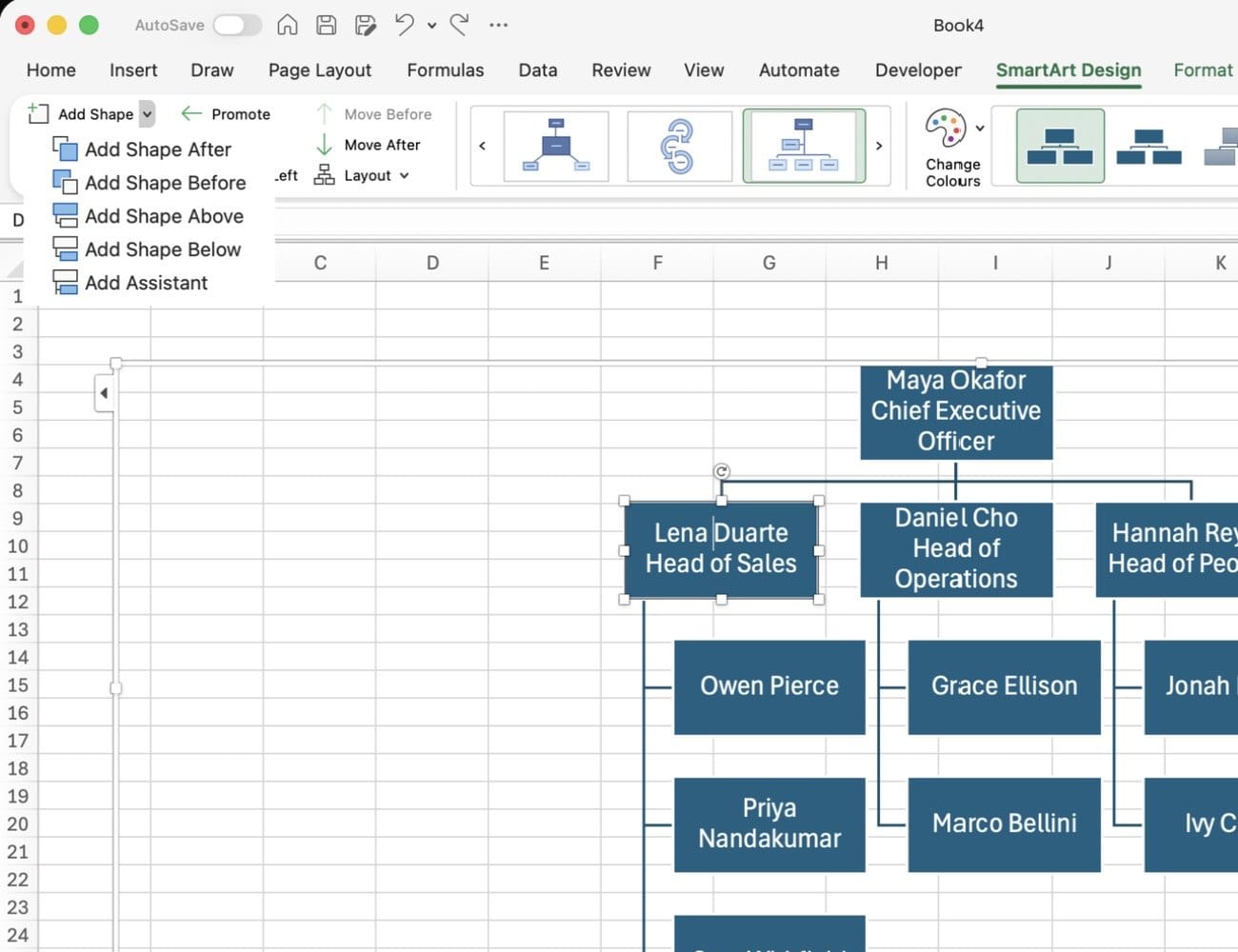
You can also add people from the chart itself. Select a box, go to SmartArt Design > Add Shape, and choose Add Shape Below to create a direct report. Add Shape After adds a peer at the same level.
Step 6: Add an executive assistant
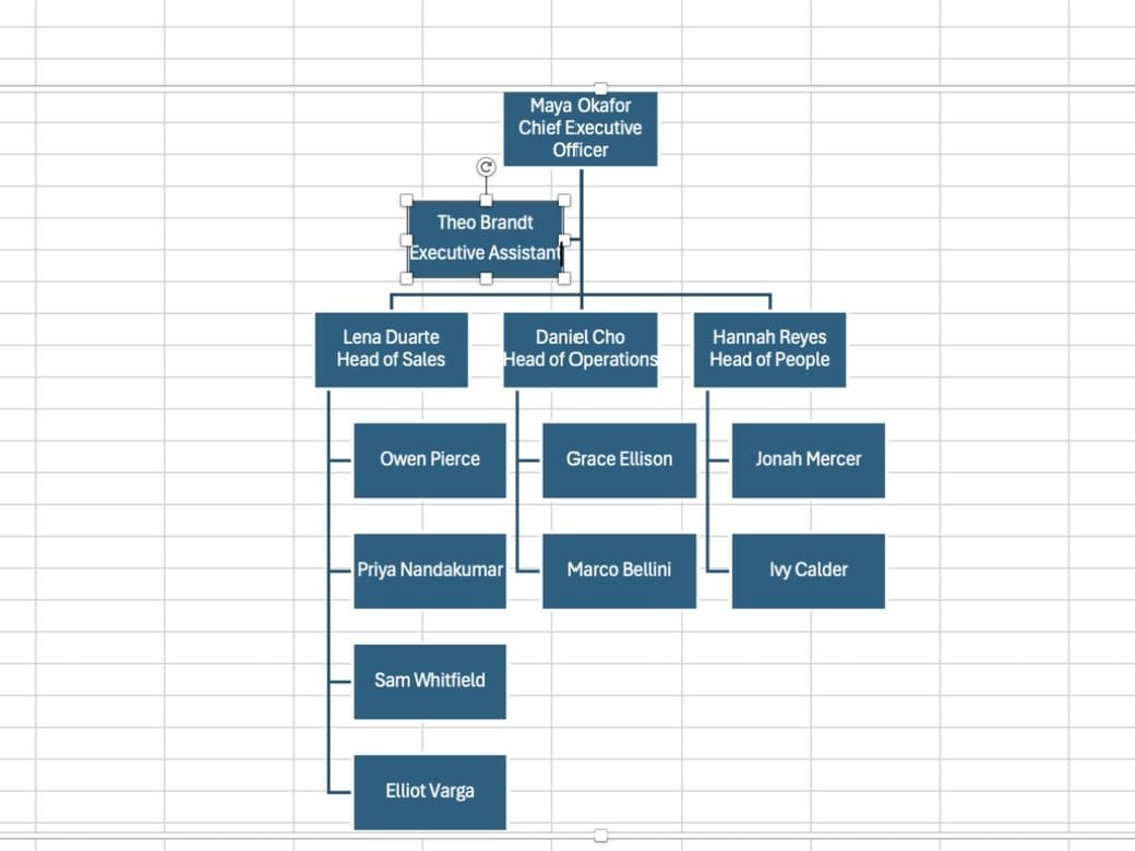
For an executive assistant, select the executive's box and choose Add Shape > Add Assistant. Excel places the assistant off to the side on an elbow connector, so they do not look like a whole department.
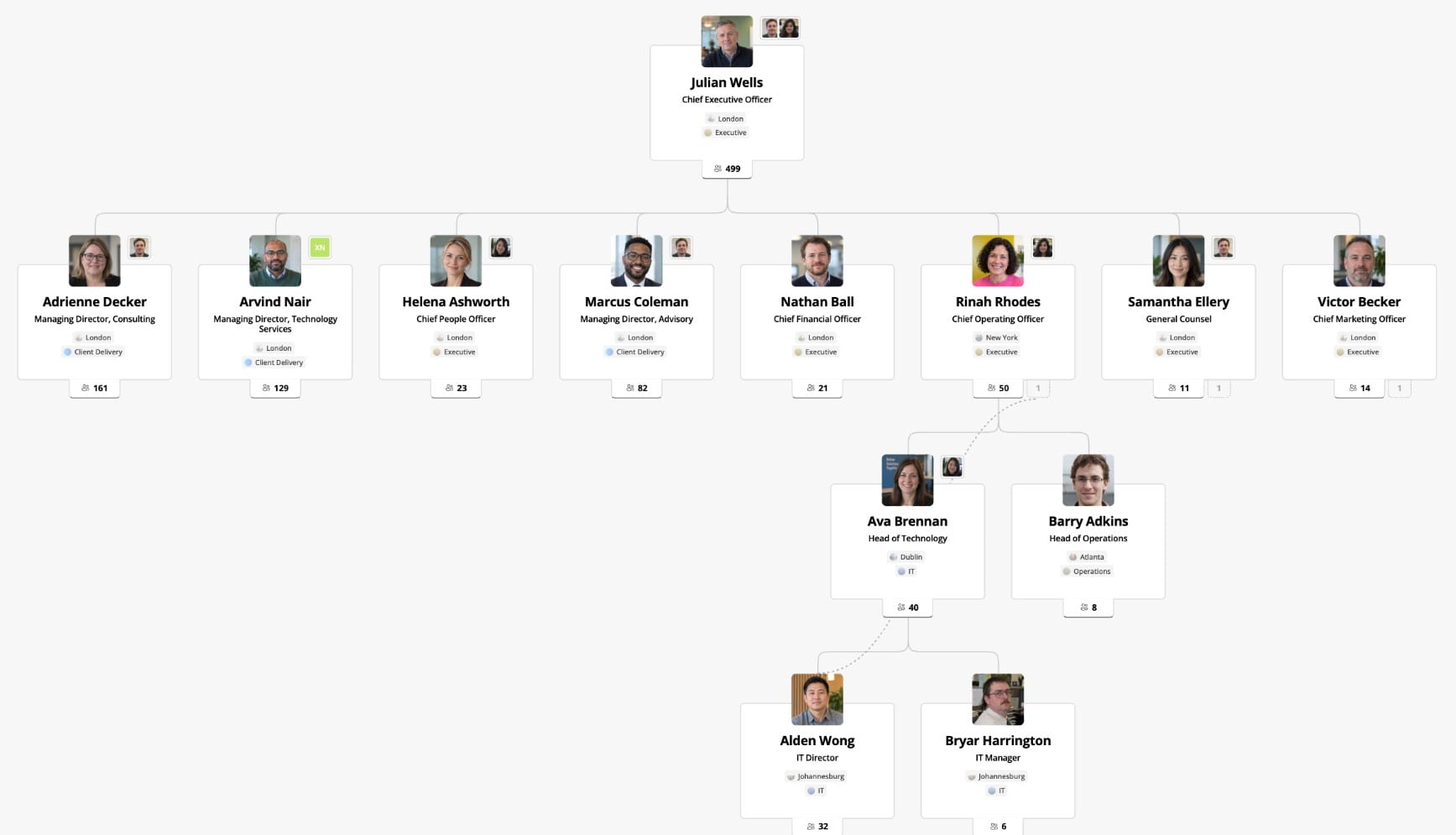
This is the one relationship SmartArt handles well. Dotted-line reporting has no equivalent, which is part of why assistants and dotted lines tend to get faked with extra boxes.
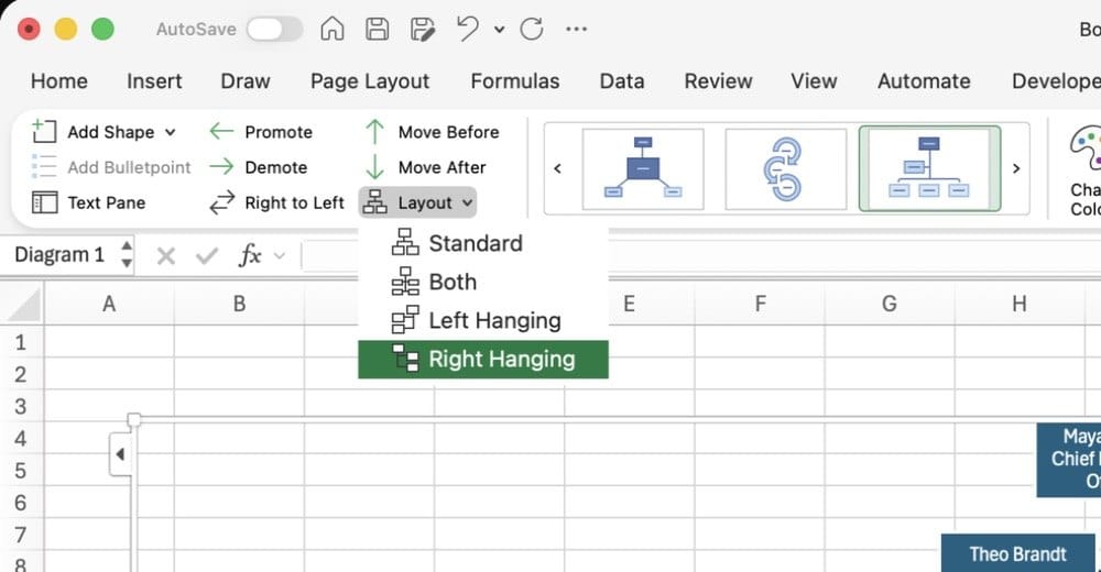
Step 7: Fix a chart that is too wide with a hanging layout
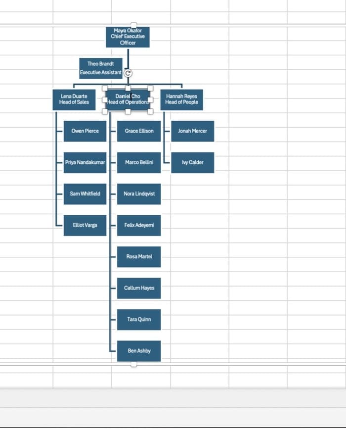
Here is the first problem you will hit. A manager with eight direct reports makes the chart very wide, and every box shrinks to fit the page.
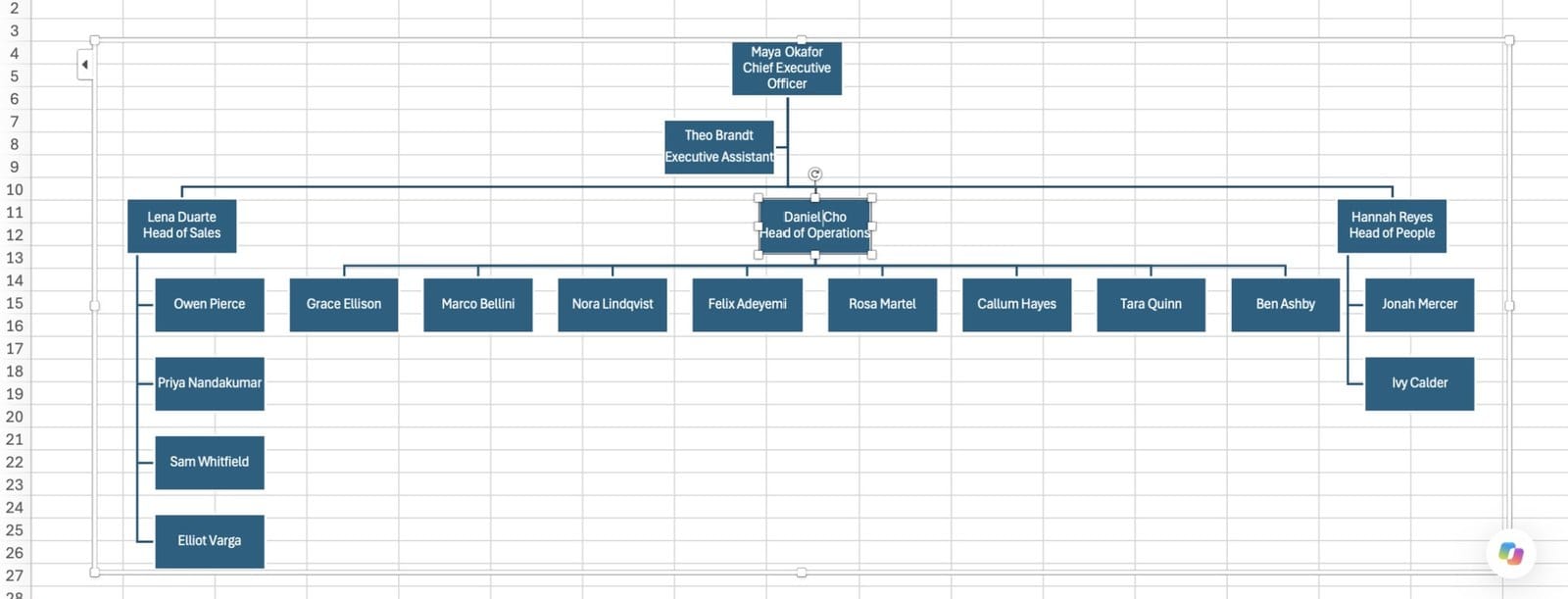
Select that manager, go to SmartArt Design > Layout, and choose a hanging layout (Left Hanging, Right Hanging or Both). Their reports stack vertically and the chart fits on the page again.
Step 8: Add photos with a picture layout
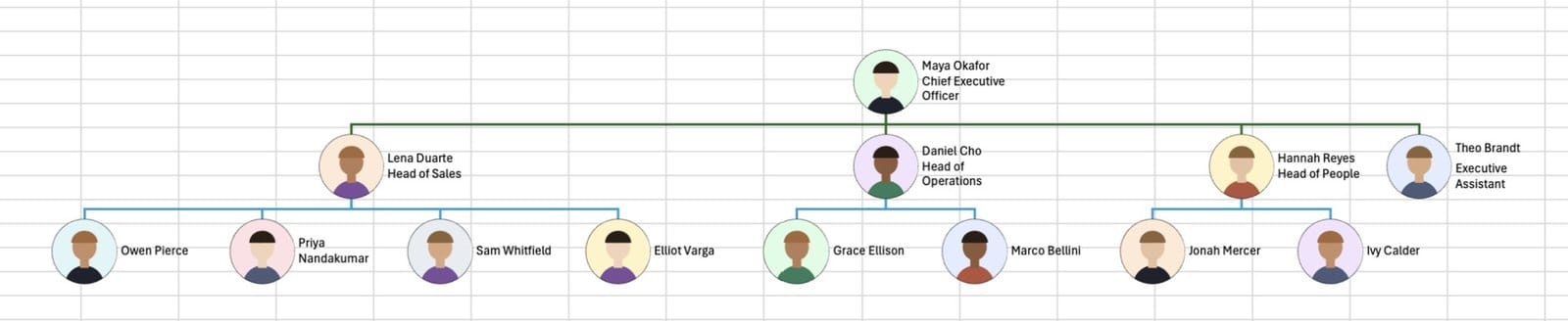
To add headshots, switch the whole graphic to a layout with picture slots. Expand the layout gallery in the middle of the SmartArt Design tab and look in the Hierarchy group.
Some Windows builds list a Picture Organization Chart layout. The Mac build I used did not, so I used Circle Picture Hierarchy, which gives each person a round picture slot. Click a slot, choose This Device, and pick the image file.

Step 9: Finish with colors and a subtle style
Use Change Colors to pick a palette, then a SmartArt Style from the gallery next to it. Keep it subtle. People need to read names, not admire gradients.
Where Excel org charts break
Excel draws the chart you give it. It cannot tell you when that chart stops being true. Three limits show up as soon as the chart is shared.
1. Nothing is connected to real data
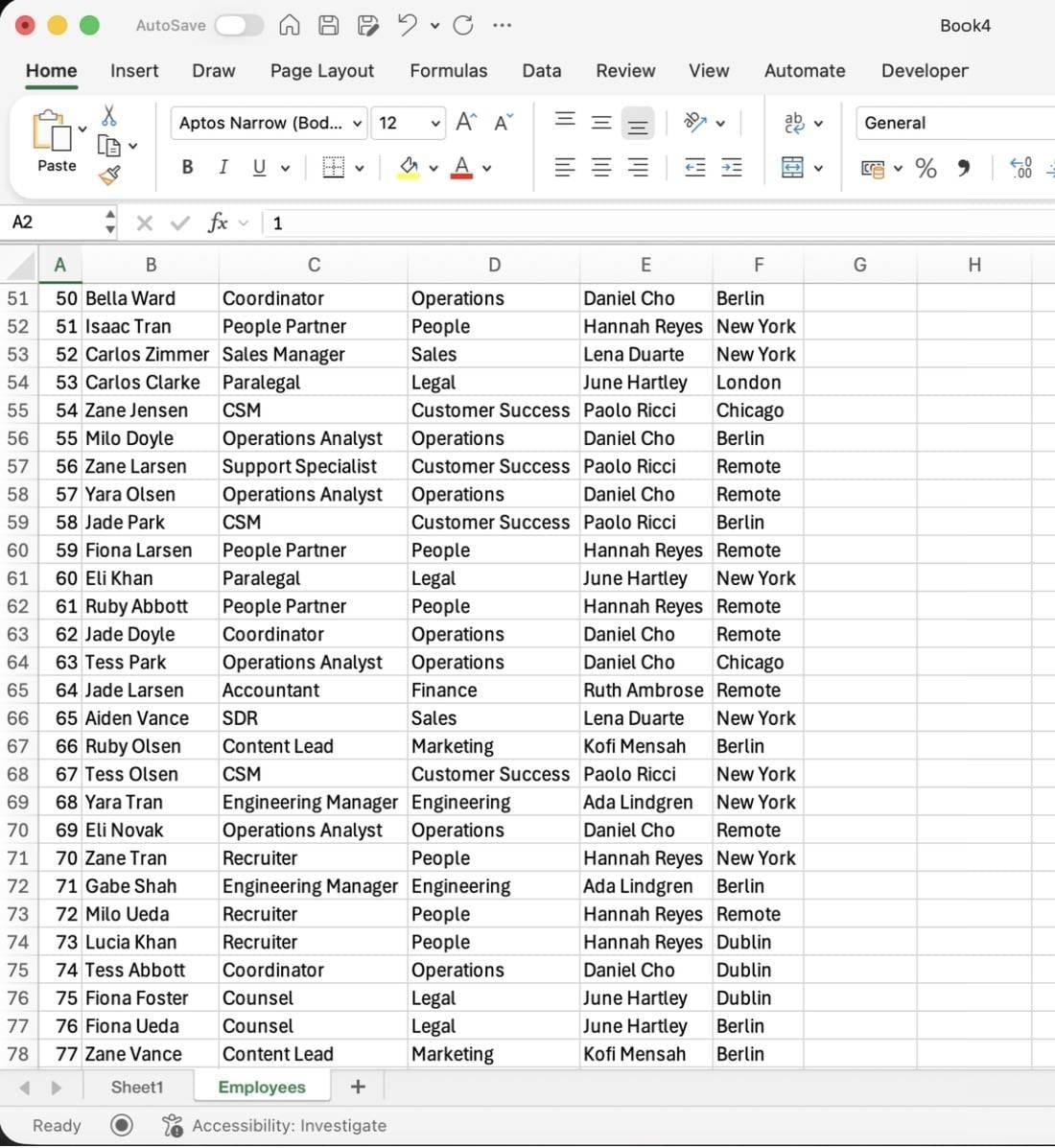
Someone joins, leaves or changes manager, and you are back in the text pane retyping it. The 13-person sample needed 13 lines typed and a Tab or Shift+Tab decision on every one. Each reorg reopens some of those decisions by hand.
2. Size
SmartArt is fine for a team of 20. A 150-person list means 150 lines and 150 indentation decisions, and the result is too small to read on one page.
3. It is out of date the day after you share it
Most org charts in PowerPoint and Excel are snapshots of a company that has already changed. We covered what that costs in the real cost of outdated org charts.
When Excel is still the right tool
For a small, stable team, Excel is a reasonable choice. Use it when:
- The chart covers fewer than about 30 people and changes a few times a year.
- You need a one-off chart for a slide, a proposal or a board pack.
- Your organization does not use Microsoft 365, so there is no directory to build from.
- You want full control over the visual layout of a single page.
If you want automation without leaving the diagramming world, Lucidchart can build a chart from a data file, though you still have to refresh the file.
The automatic alternative: build the org chart from your directory
If your company already keeps people data in Microsoft 365, the reporting lines exist. OneDirectory reads people, job titles, departments and managers from Microsoft Entra ID and builds the chart from that. When a manager changes in Entra ID, the chart changes on the next sync.
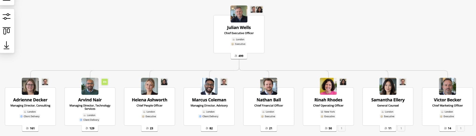
Every box is a live profile, so people can click through to anyone or search for them. Dotted-line and assistant relationships, the ones Excel fakes with extra boxes, show on the chart itself.
The catch: the chart is only as good as the manager field
An automatic chart moves the work from drawing to data. When we looked at 65 organizations at the moment they first connected Microsoft 365, only 42% of profiles had a manager filled in. That figure describes untouched Entra ID data before any cleanup, so it is a baseline, not a product verdict. The full dataset is in The State of Employee Directories in 2026.
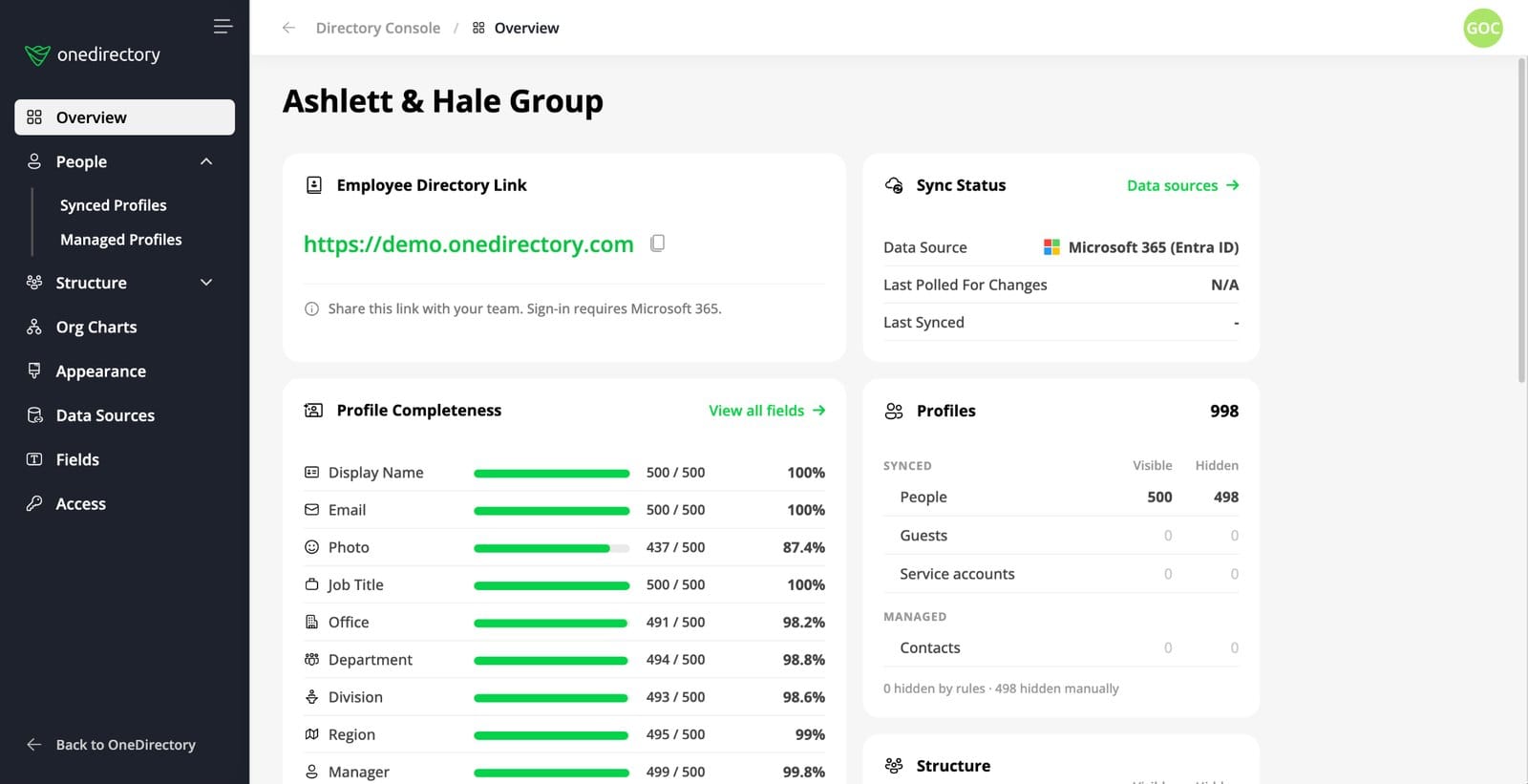
The Directory Console shows which fields are missing, so you can fix them at the source in Entra ID. The five missing fields that break an org chart are the place to start.
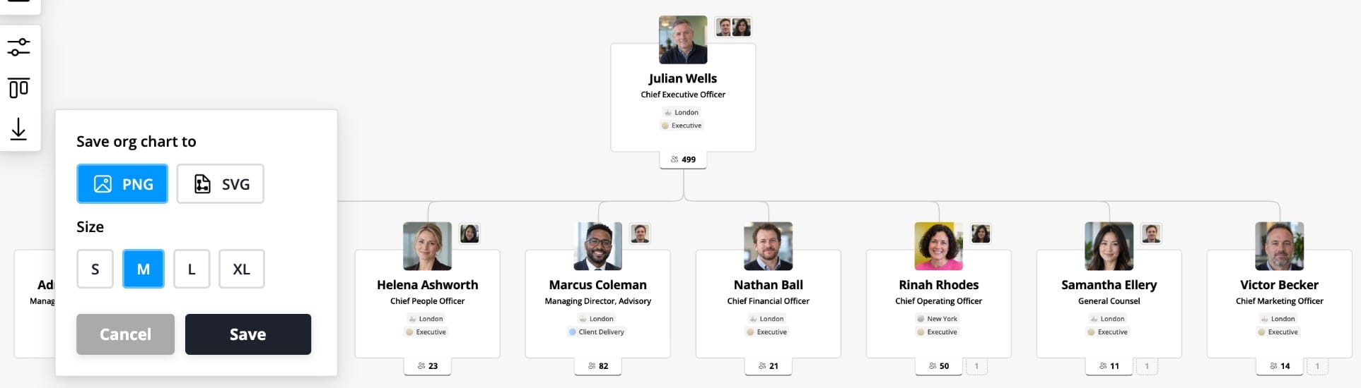
When you need the chart in a deck, export it as an image (PNG or SVG) from the chart toolbar.
Excel vs. an automatic org chart
| Excel SmartArt | OneDirectory | |
|---|---|---|
| Source of the hierarchy | Typed and indented by hand | Manager field in Microsoft Entra ID |
| Updates when someone changes manager | Retype it | On the next sync |
| Assistants | Add Assistant | Shown on the chart |
| Dotted-line reporting | Not supported | Shown on the chart |
| Photos | Insert one at a time | From profile photos |
| Practical size | Roughly 20 to 30 people per page | Hundreds or thousands, expand as you go |
| Export | Copy or save the workbook | PNG or SVG image |
| Needs Microsoft 365 | No | Yes |
FAQ
Does Excel have an org chart template?
Yes. Use Insert > SmartArt > Hierarchy > Organization Chart. It is built in, so there is nothing to download.
Can I make an org chart in Excel for the web?
Not with SmartArt. When I tested Excel for the web, its Insert tab had no SmartArt option. Use the desktop app, or draw the chart with Shapes by hand.
How do I make one person report to another in an Excel org chart?
Open the text pane, put the person on the line below their manager, and press Tab. Shift+Tab moves them back up a level.
Can an Excel org chart have photos?
Yes. Switch to a picture layout such as Picture Organization Chart or Circle Picture Hierarchy, then click each picture slot to insert an image.
Can Excel build an org chart from a list of employees and managers automatically?
Not with SmartArt. It cannot read a Manager column, so you retype the hierarchy in the text pane. To build a chart from manager data automatically, you need org chart software that reads your directory or a data file.
How many people can an Excel org chart handle?
As a rule of thumb, SmartArt stays readable for about 20 to 30 people per page. Beyond that, boxes become too small to read and every reorg means editing many lines by hand.